 |
| Click for full size image |
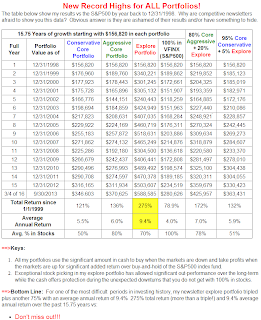
This table shows my newsletter "Core and Explore Portfolios" from 1998 through the end of Q3
Don't Miss Out!
Subscribe Now
and get the November issue for free
(Start subscription with December issue)
Subscribe Now
and get the November issue for free
(Start subscription with December issue)


No comments:
Post a Comment