
The Dow Jones Industrial Average measured in how many ounces of gold it takes to buy the 30 stock DOW is up 33% from its 17-year March 6th low of 7.03. Despite that impressive gain, the DOW-Gold ratio remains 79% below its 1999 peak of 44.77.
Here is a chart showing the current Dow to Gold Ratio, the ratio of the price of the Dow Jones Industrial Average to the price of gold. When measured in ounces of Gold, the DOW has been in a secular bear market since peaking in late 1999.
Here is a chart showing the current Dow to Gold Ratio, the ratio of the price of the Dow Jones Industrial Average to the price of gold. When measured in ounces of Gold, the DOW has been in a secular bear market since peaking in late 1999.
 Click chart courtesy of stockcharts.com for full size image
 The markets, measured by the S&P500 (S&P500 Charts) and DIJA (DJIA Charts), may have recovered to new highs in 2007, but the DOW:Gold ratio told a different, truer story of just how unhealthy the US economy was.
- Back in 1999, it took 45 ounces of gold to buy the DJIA.
- On Friday March 6 of 2009 the DOW-Gold ratio hit a low of 7.03
- As of Friday (May 9, 2009) it only took 9.36 ounces of gold to buy the DOW, a nice jump from the recent low.
The scary part is the DJIA-to-Gold ratio got down near 1 in the early 1980s and was just under 0.2 in the early 1800s.
Which way do you think the DOW-Gold ratio is headed? Post your answer here.
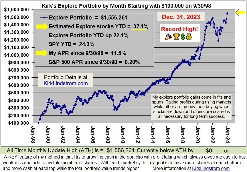
Since 12/31/98 through 5/8/09 "Kirk's Newsletter Explore Portfolio" is UP 107% (over a double!) vs. the S&P500 DOWN 11% . Subscribe NOW and get the May 2009 Issue for FREE!
The DOW/Gold ratio broke out of the "symmetrical triangle" pattern, explained below, when we entered our first recession and the markets were in the March 2000 to October 2002 bear market.
The good news is the chart shows the DOW:Gold ratio is very over sold.
This 200 Year Dow/Gold Chart courtesy of www.sharelynx.com (Click for full size image) shows the DOW/Gold ratio from 1800 through August 2008.

With the DOW:Gold ratio now at 9.36, it is trading below the green zone in the second chart. The ratio is oversold, but nothing says it can't get more "oversold."
CDs have been a "safe haven" for those wishing to preserve assets and get a small inflation adjusted return. See "Very Best CD Rates with FDIC" for a list of the best rates and terms.
US Treasury rates are so low, that they are paying less than long term inflation. See:
Which way do you think the DOW-Gold ratio is headed? Post your answer here.
Since 12/31/98 through 5/8/09 "Kirk's Newsletter Explore Portfolio" is UP 107% (over a double!) vs. the S&P500 DOWN 11% . Subscribe NOW and get the May 2009 Issue for FREE!
The DOW/Gold ratio broke out of the "symmetrical triangle" pattern, explained below, when we entered our first recession and the markets were in the March 2000 to October 2002 bear market.
The good news is the chart shows the DOW:Gold ratio is very over sold.
This 200 Year Dow/Gold Chart courtesy of www.sharelynx.com (Click for full size image) shows the DOW/Gold ratio from 1800 through August 2008.
With the DOW:Gold ratio now at 9.36, it is trading below the green zone in the second chart. The ratio is oversold, but nothing says it can't get more "oversold."
CDs have been a "safe haven" for those wishing to preserve assets and get a small inflation adjusted return. See "Very Best CD Rates with FDIC" for a list of the best rates and terms.
US Treasury rates are so low, that they are paying less than long term inflation. See:
More on "Symetrical Triangle" chart patterns: The Bible for technical analysis, Technical Analysis of Stock Trends, by Robert Edwards and John Magee, says about 75% of symmetrical triangles are continuation patterns and the rest mark reversals. This book makes a great Gift!
The "return to the apex" of the Gold/DOW ratio in late 2001, early 2002 confirmed the technical breakdown of this chart pattern. The Bible for technical analysis, Technical Analysis of Stock Trends, by Robert Edwards and John Magee, says about 75% of symmetrical triangles are continuation patterns and the rest mark reversals. This book makes a great Gift!Since 12/31/98 through 5/8/09 "Kirk's Newsletter Explore Portfolio" is UP 107% (over a double!) vs. the S&P500 DOWN 11% . Subscribe NOW and get the May 2009 Issue for FREE!


 kirklindstrom.com

It's going to 1
ReplyDeleteBetween 1 and 2
ReplyDeleteImpressive charts! Looks like we have a ways to go down on the Indu:Gold ratio. This would fit with a higher inflation cycle I see coming up.
ReplyDeleteI'll go with 3.
surely below the 7:1 ratio reached in march
ReplyDelete