
NAAIM Sentiment Charts - National Association of Active Investment Managers
Here is a chart for another sentiment index from the "National Association of Active Investment Managers" or NAAIM.

click for full size image
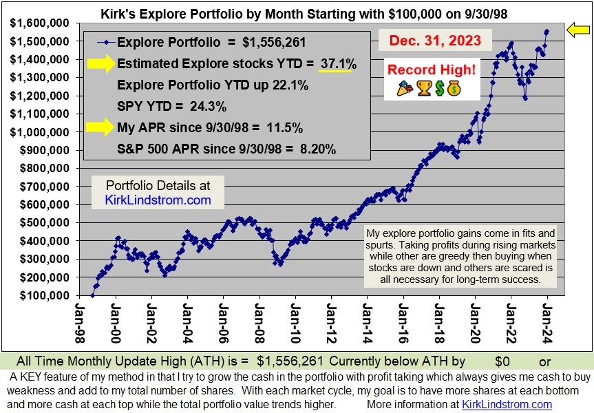
2010 YTD my "Explore Portfolio" is up 20.7% YTD
(Subscribe Now - FREE Sample Issue - More Info - Return Data )
(Subscribe Now - FREE Sample Issue - More Info - Return Data )
Recent NAAIM Data
| Date | NAAIM Number Mean/Average |
| 12/22/2010 | 81.83 |
| 12/15/2010 | 74.74 |
| 12/8/2010 | 63.11 |
| 12/1/2010 | 62.47 |
| 11/24/2010 | 66.67 |
| 11/17/2010 | 66.59 |
| 11/10/2010 | 71.46 |
| 11/3/2010 | 69.47 |
According to the NAAIM website, NAAIM member firms who are active money managers are asked each week to provide a number which represents their overall equity exposure at the market close on a specific day of the week, currently Wednesdays. Responses can vary widely as indicated below. Responses are tallied and averaged to provide the average long (or short) position or all NAAIM managers, as a group.
Range of Responses
- 200% Leveraged Short
- 100% Fully Short
- 0% 100% Cash or Hedged to Market Neutral
- 100% Fully Invested
- 200% Leveraged Long.
The National Association of Active Investment Managers or NAAIM was formed in 1989 as a non-profit association of registered investment advisors who provide active money management services to their clients, in order to produce favorable risk-adjusted returns as an alternative to more passive, buy and hold strategies. Originally called SAAFTI and comprised of a small group of successful, passionate firms, NAAIM has grown to include roughly 200 member firms nationwide, managing an estimated $14 billion. NAAIM's purpose is to promote the common interests of those investment advisors who provide active investment management services to clients.
NAAIM defines "active investment management services" as taking an active role in the ongoing process of investment selection and risk management with the objective of improving a portfolio's risk/reward relationship. The active management strategies used by our members are diverse, and utilize a broad range of securities including mutual funds, variable annuities, equity baskets, index-linked, exchange-traded securities, futures and other innovative products.
Since 12/31/98 "Kirk's Newsletter Explore Portfolio" is UP 213% vs. the S&P500 UP only 25% vs. NASDAQ UP a only 22% (All through 12/27/10)
In 2009, "Kirk's Newsletter Explore Portfolio" gained 33.5% vs. the DJIA up 18.8%
2010 YTD my "Explore Portfolio" is up 20.7% YTD
(the explore portfolio has 70% in equities and 30% in fixed income so the stocks are doing very, very well)
In 2009, "Kirk's Newsletter Explore Portfolio" gained 33.5% vs. the DJIA up 18.8%
2010 YTD my "Explore Portfolio" is up 20.7% YTD
(the explore portfolio has 70% in equities and 30% in fixed income so the stocks are doing very, very well)


 kirklindstrom.com
