Don't Miss Out On Great Gains! - Best Investment Newsletter


Click for FREE sample of Kirk Lindstrom's Investment Letter

Don't miss out! Subscribe Now

google.com, pub-7001134751860982, DIRECT, f08c47fec0942fa0

Search For More

Monday, December 27, 2010

NAAIM Sentiment National Association Active Investment Managers

NAAIM Sentiment Charts - National Association of Active Investment Managers 
Here is a chart for another sentiment index from the "National Association of Active Investment Managers" or NAAIM.
click for full size image

2010 YTD my "Explore Portfolio" is up 20.7% YTD
(Subscribe Now - FREE Sample Issue - More Info - Return Data )

Recent NAAIM Data
Date NAAIM Number
Mean/Average
12/22/2010 81.83
12/15/2010 74.74
12/8/2010 63.11
12/1/2010 62.47
11/24/2010 66.67
11/17/2010 66.59
11/10/2010 71.46
11/3/2010 69.47
According to the NAAIM website, NAAIM member firms who are active money managers are asked each week to provide a number which represents their overall equity exposure at the market close on a specific day of the week, currently Wednesdays. Responses can vary widely as indicated below. Responses are tallied and averaged to provide the average long (or short) position or all NAAIM managers, as a group.

Range of Responses
  • 200% Leveraged Short
  • 100% Fully Short
  • 0% 100% Cash or Hedged to Market Neutral
  • 100% Fully Invested
  • 200% Leveraged Long.
The National Association of Active Investment Managers or NAAIM was formed in 1989 as a non-profit association of registered investment advisors who provide active money management services to their clients, in order to produce favorable risk-adjusted returns as an alternative to more passive, buy and hold strategies. Originally called SAAFTI and comprised of a small group of successful, passionate firms, NAAIM has grown to include roughly 200 member firms nationwide, managing an estimated $14 billion. NAAIM's purpose is to promote the common interests of those investment advisors who provide active investment management services to clients.
NAAIM defines "active investment management services" as taking an active role in the ongoing process of investment selection and risk management with the objective of improving a portfolio's risk/reward relationship. The active management strategies used by our members are diverse, and utilize a broad range of securities including mutual funds, variable annuities, equity baskets, index-linked, exchange-traded securities, futures and other innovative products.

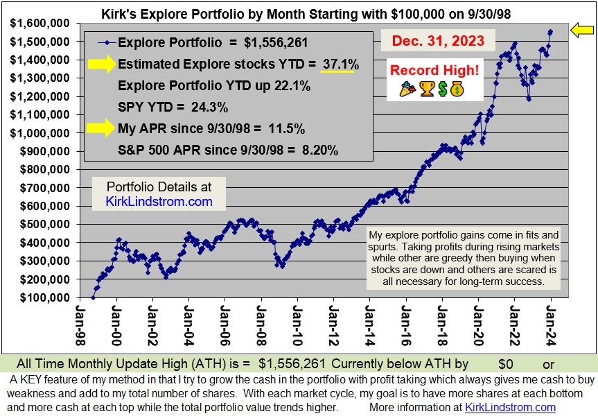
 Since 12/31/98 "Kirk's Newsletter Explore Portfolio" is UP 213%  vs. the S&P500 UP only 25% vs. NASDAQ  UP a only 22%   (All through 12/27/10) 
In 2009, "Kirk's Newsletter Explore Portfolio" gained 33.5% vs. the DJIA up 18.8%

2010 YTD my "Explore Portfolio" is up 20.7% YTD
(the explore portfolio has 70% in equities and 30% in fixed income so the stocks are doing very, very well)

Wednesday, December 22, 2010

Best Investment & Retirement Portfolios for the Long-term

Charles Munger, Warren Buffett, Berkshire Hathaway and Kirk Lindstrom's Explore portfolio

What do Charles T. Munger and Warren E. Buffett`s Berkshire Hathaway (BRKA) have in common with Kirk Lindstrom's Explore Portfolio?

Commonalities:
  • All invest for the long-term where first priority is getting good value for the investment dollar in companies we like for above average long-term growth.
  • Both Berkshire Hathaway and "Kirk Lindstrom's Explore Portfolio" take profits when investments are successful so we can maintain a cash reserve of roughly 20% to 40% for future opportunities.
  • Both have performed far better than buy and hold the S&P500 the past decade. 
  • Both believe we can beat the market by buying good stocks for the long term when they are priced correctly.
Differences:
  • Berkshire Hathaway has a significant premium in the price for its aging managers. 
  • Charley Munger was born January 1, 1924 (in Omaha, Nebraska) and Warren Buffet was bone on August 30, 1930. Both men are older than my now deceased parents.   I was born April 5, 1957.
  • Through my understanding of technology from working as a research and development (R&D) engineer AND scientist at Hewlett Packard from 1978 to 1998, I've been able to invest in quality technology stocks so my portfolio has more than doubled the annual return for BRKA since I started my newsletter.
The stupid sees difficulty in every opportunity; the intelligent sees opportunity in every difficulty. --Nahsti 
From Interview with Charlie Munger :
Q: What do you think of the efficient market theory, which holds that at any one time all knowledge by everyone about a stock is reflected in the price?

A: “I think it is roughly right that the market is efficient, which makes it very hard to beat merely by being an intelligent investor. But I don't think it's totally efficient at all. And the difference between being totally efficient and somewhat efficient leaves an enormous opportunity for people like us to get these unusual records. It's efficient enough, so it's hard to have a great investment record. But it's by no means impossible. Nor is it something that only a very few people can do. The top three or four percent of the investment management world will do fine.”
From Poor Charlie's Almanack: The Wit and Wisdom of Charles T. Munger
Returns for last 12 years
Click for Full Size Table

I recommend a "core" portfolio for about 80 to 95% of your funds and an "explore" portfolio made of stocks from my newsletter "explore portfolio" for the remainder. My newsletter stocks are volatile by design to add to overall returns, but you need a good core portfolio to sleep well at night. I offer several different core portfolios for both aggressive & conservative (retired) investors.
Since starting this newsletter in 1998, I have grown my "Explore Portfolio" 388% from $100,000 to $487,644. Over the same period (September 30, 1998 through December 21, 2010) the S&P 500 (with dividends reinvested) is only up 50.5%).


For 2010 through December 21, my “explore portfolio” is up 20.0% YTD vs. S&P500 up 14.6% & DJIA up 10.6% YTD. The explore portfolio was roughly 70% equities for the year so the stocks in the portfolio had a banner year!

In 2009, my "Explore Portfolio" gained 33.5% while the S&P500 and DJIA gained 26.5% and 18.8%, respectively.

More from Charlie Munger:
Q: What about people who want to pick stocks?

A: You're back to basic Ben Graham, with a few modifications. You really have to know a lot about business. You have to know a lot about competitive advantage. You have to know a lot about the maintainability of competitive advantage. You have to have a mind that quantifies things in terms of value. And you have to be able to compare those values with other values available in the stock market. So, you're talking about a pretty complex body of knowledge.
Charlie Munger, From Poor Charlie's Almanack: The Wit and Wisdom of Charles T. Munger
Subscribe NOW and get the December 2010 Issue for FREE!   
Your 1 year, 12 issue subscription will start with next month's issue.

Friday, December 10, 2010

ECRI's WLI & WLI Growth Rate Highest Since May

ECRI's WLI & WLI Growth Rate Continue Higher
The Economic Cycle Research Institute, ECRI - a New York-based independent forecasting group, released their latest readings for their proprietary Weekly Leading Index (WLI) this morning. (More about ECRI
For the week ending December 3, 2010
  • WLI  is 126.4 up from the prior week's revised lower reading of 125.3.  (Last week we reported WLI was 125.4)   This is the best reading for WLI since the week of May 14 when it stood at 127.0.
  • The lowest reading for WLI this year was 120.4 for the week ending July 16.
  • Since apparently bottoming at -10.3 for the week of August 27,  WLI growth moved higher or was flat for the 14th consecutive week to minus 1.5% from minus 2.4% a week ago.  
  • This is the best reading for WLI growth since the week ending May 28, 2010 when it stood at positive 0.1%.
On November 30 we reported in "ECRI Calls for Revival of US Economic Growth" that ECRI said "with a lot of conviction, that there is a revival in growth right ahead of us." 
Commenting on today's release, ECRI's Chief Operations Officer, Lakshman Achuthan said: "With both the WLI and its growth rate rising to their best readings since May, a “double dip” back into recession remains off the table, notwithstanding self-serving recession warnings that feed fear itself."
Chart of WLI and WLI growth vs GDP Growth   
 
click to view full size charts
Since ECRI releases their WLI numbers for the prior week and the stock market is known in real time, you can sometimes get a clue for next week's WLI from the weekly change in the stock market. Notably, in the lead-up to the last two recessions, the WLI turned down months before the stock market did.
Chart of S&P500 vs ECRI's WLI
I want to point out that a correction in the stock market now would not necessarily change ECRI's call for an economic growth rate revival.  It takes a "pervasive" (for the majority) change of direction of their indicators in a "pronounced and persistent" way for ECRI to call for a turn in the economic cycle. These indicators and the trigger levels are proprietary.  I have found no one who has duplicated them or ECRI's success in calling business cycle turns based on their reading of their indicators.
Note that the chart above of the S&P500 vs. WLI shows a breakout above the dashed green line that represents the neckline for a "Head and Shoulders Bottom" pattern.  This is a very bullish development.  A correction to test the pattern from above with a bounce to a higher high would be even more bullish, but not necessary for a continued market advance.
Chart of WLI from 1973 to 2010
 Chart courtesy of ECRI
Notes: 
  1. The WLI for the week ending 12/10/10 will be released on 12/17/10
  2. Occasionally the WLI level and growth rate can move in different directions, because the latter is derived from a four-week moving average.
  3. ECRI uses the WLI level and WLI growth rate to HELP predict turns in the business cycle and growth rate cycle respectively. Those target cycles are not the same as GDP level or growth, but rather a set of coincident indicators (including production, employment income and sales) that make up the coincident index. Based on two additional decades of data not available to the general public, there are a couple of occasions (in 1951 and 1966) when WLI growth fell well below negative ten, but no recessions resulted (although there were clear growth slowdowns).  
  4. For a better understanding of ECRI's indicators, read their book, Beating the Business Cycle.
My take on ECRI's indicators, WLI and FIG plus how they relate to investments is included in "Kirk Lindstrom's Investment Letter."  FREE SAMPLE

Since 12/31/98 "Kirk's Newsletter Explore Portfolio" is UP 205%  vs. the S&P500 UP only 22% vs. NASDAQ  UP a only 19%   (All through 12/9/10)
( More Info - Return Data )

In 2009, "Kirk's Newsletter Explore Portfolio" gained 33.5% vs. the DJIA up 18.8%

2010 YTD my "Explore Portfolio" is up 17.8% YTD
(My explore portfolio has 70% in equities and 30% in fixed income so the stocks are doing very, very well!!)

Subscribe NOW  
and get the This Month's Issue for FREE! !
Your 1 year, 12 issue subscription will start with next month's issue.
Disclosure:  I am long the exchange traded fund for the S&P500, SPY( charts and quote,) in my personal account and in the "Explore Portfolio" in  "Kirk Lindstrom's Investment Letter."

KEY ECRI Articles:

Thursday, December 09, 2010

2010 Semiconductor Vendor Sales Ranking

Top Ten Worldwide Semiconductor Vendors

Preliminary Ranking by Estimated Revenue
Rank
2009
Rank
2010
Company 2009 Revenue
US$M
2010 Revenue
US$M
2009-2010 Growth (%) 2010 Market Share (%)
1 1 Intel 33,253 41,430 24.6 13.8
2 2 Samsung Electronics 17,686 28,256 59.8 9.4
3 3 Toshiba 9,604 12,376 28.9 4.1
4 4 Texas Instruments 9,142 12,356 35.2 4.1
11 5 Renesas Electronics* 4,542 10,368 128.3 3.5
7 6 Hynix Semiconductor 6,035 10,350 71.5 3.4
5 7 STMicroelectronics 8,510 10,290 20.9 3.4
13 8 Micron Technology ** 4,170 8,884 113.0 3.0
6 9 Qualcomm 6,409 7,167 11.8 2.4
10 10 Infineon 4,682 6,680 42.7 2.2


Others 124,338 152,156 22.4 50.7


Total 228,371 300,313 31.5 100.0

* NEC Electronics was renamed Renesas Electronics in 2Q10. This name change has been applied retrospectively to 2009 to maintain continuity. Renesas Electronics acquired Renesas Technology in 2Q10. According to Gartner's merger and acquisition policy (restated in December 2009), Renesas Technology's revenue has been attributed to Renesas Electronics for 2Q10 through 4Q10. NEC Electronics' 1Q10 revenue has been attributed to Renesas Electronics for 2010, while Renesas Technology's 1Q10 revenue ($1,731 million) has been accounted for separately.
** Micron's revenue includes partial revenue from Numonyx, which it acquired in early 2010.

Source: Gartner Says Worldwide Semiconductor Revenue Increased 31.5 Percent in 2010 to Exceed $300 Billion

Wednesday, December 08, 2010

CalPERS Aristocracy - Public Pension Reform Parody

This wonderful video explains a big part of why California is going bankrupt with an estimated $25B budget deficit for the current fiscal year with revenue of roughly $83B.


2010-11 $20B Budget Shortfall
  • $6.6 billion: Current budget year shortfall due to slow revenues and nearly $5 billion worth of federal and state court decisions that mandated spending on programs cut in the 09-10 budget.
  • $12.3 billion: Projected shortfall for 2010-11 due to unfunded mandates and a still slow economy.
  • $1 billion: Modest reserve.
I read this $20B shortfall relies on moving anther $5 to $6B into 2011-2012 so the actual amount we Californians are in the hole is over $25B.

What is amazing is here in CA we have:
  • 9.75% sales tax in some counties like Los Angeles
  • 10% income tax on top earners
    Tax Rates by State
  • very high property costs.  The property tax on the average home in Santa Clara County is close to $10,000 a year.  
  • We have extra taxes on gasoline that is supposed to help build and maintain our roads. I paid $3.49 per gallon for 91 Octane (1994 Corvette) just the other day.
and yet the California government can't balance its budget!

Friday, December 03, 2010

ECRI's WLI Down but Growth Rate Higher

ECRI's WLI Ticks Lower But WLI Growth Rate Continues Higher
The Economic Cycle Research Institute, ECRI - a New York-based independent forecasting group, released their latest readings for their proprietary Weekly Leading Index (WLI) this morning. (More about ECRI
For the week ending November 26, 2010
  • WLI  is 125.4 down from the prior week's revised lower reading of 126.0.  (Last week we reported WLI was 126.4)  
  • The lowest reading for WLI this year was 120.4 for the week ending July 16.
  • Since apparently bottoming at -10.3 for the week of August 27,  WLI growth moved higher or was flat for the 13th consecutive week to minus 2.4% from minus 3.3% a week ago.  
  • The last positive reading for WLI growth was for the week ending May 28, 2010 when it stood at positive 0.1%.
Last week on November 30 we reported in "ECRI Calls for Revival of US Economic Growth" that ECRI said "with a lot of conviction, that there is a revival in growth right ahead of us."  If you have read their book, Beating the Business Cycle, you know the WLI indicators must be persistent, pronounced and pervasive before ECRI will call for a turn in the US economy.   
You can clearly see the persistent and pronounced turn in WLI and its growth rate in this chart below.  Now that ECRI made its call for a turn in the business cycle, we know that the improving economic data is PERVASIVE too.  
Today's jobs report is disappointing because the 39,000 new jobs created in November is fewer than needed absorb new workers so the unemployment rate went higher.  The good news is it was a positive number.  If you add the upward revisions of 38,000 more jobs to the September and October numbers, then 72,000 more jobs were created than reported last month.  
Chart of WLI and WLI growth vs GDP Growth   
  click to view full size charts
Since ECRI releases their WLI numbers for the prior week and the stock market is known in real time, you can sometimes get a clue for next week's WLI from the weekly change in the stock market. Notably, in the lead-up to the last two recessions, the WLI turned down months before the stock market did.
Chart of S&P500 vs ECRI's WLI
 
I want to point out that a correction in the stock market now would not necessarily change ECRI's call for an economic growth rate revival.  It takes a "pervasive" (for the majority) change of direction of their indicators in a "pronounced and persistent" way for ECRI to call for a turn in the economic cycle. These indicators and the trigger levels are proprietary.  I have found no one who has duplicated them or ECRI's success in calling business cycle turns based on their reading of their indicators.
Note that the chart above of the S&P500 vs. WLI shows a breakout above the dashed green line that represents the neckline for a "Head and Shoulders Bottom" pattern.  This is a very bullish development.  A correction to test the pattern from above with a bounce to a higher high would be even more bullish, but not necessary for a continued market advance.
Chart of WLI from 1973 to 2010
 Chart courtesy of ECRI
Notes: 
  1. The WLI for the week ending 12/3/10 will be released on 12/10/10
  2. Occasionally the WLI level and growth rate can move in different directions, because the latter is derived from a four-week moving average.
  3. ECRI uses the WLI level and WLI growth rate to HELP predict turns in the business cycle and growth rate cycle respectively. Those target cycles are not the same as GDP level or growth, but rather a set of coincident indicators (including production, employment income and sales) that make up the coincident index. Based on two additional decades of data not available to the general public, there are a couple of occasions (in 1951 and 1966) when WLI growth fell well below negative ten, but no recessions resulted (although there were clear growth slowdowns). 
My take on ECRI's indicators, WLI and FIG plus how they relate to investments is included in "Kirk Lindstrom's Investment Letter."  FREE SAMPLE

Since 12/31/98 "Kirk's Newsletter Explore Portfolio" is UP 196% vs. the S&P500 UP only 21% vs. NASDAQ  UP a only 18%   (All through 12/3/10) 

In 2009, "Kirk's Newsletter Explore Portfolio" gained 33.5% vs. the DJIA up 18.8%

2010 YTD the "Explore Portfolio" is up 14.3% YTD
(My explore portfolio has 70% in equities and 30% in fixed income so the stocks are doing very, very well!!)

Subscribe NOW  
and get the This Month's Issue for FREE! !
Your 1 year, 12 issue subscription will start with next month's issue.
Disclosure:  I am long the exchange traded fund for the S&P500, SPY( charts and quote,) in my personal account and in the "Explore Portfolio" in  "Kirk Lindstrom's Investment Letter."

KEY ECRI Articles:


    Thursday, December 02, 2010

    Fund Flows: Equity, Bond & Money Market Yearly Totals

    Equity, Bond & Money Market Fund Flows - Yearly Totals & 2010 YTD

    Weekly Data for 12/1/2010 
    • Equity Fund outflows $1.2 Bil
    • Taxable Bond Fund outflows $0.525 Bil
      xETFs:
    • Equity Fund outflows $1.1 Bil
    • Taxable Bond Fund outflows $0.109 Bil
    • See bottom for a table of current US Treasury rates. 
    This table shows a summation of the weekly fund flow data.  Money Market funds yield next to nothing so people have taken money out to buy bonds as well as live on during the recession and long recovery period with US unemployment still near 10%. 

    I think many will be surprised at how quickly equities go up in value once interest rates start to climb and people dump bond funds that start to lose money.  The money will flow into what is hot, which will be equities and that will probably drive the next bubble.  My explore portfolio gained 33.5% last year with a tiny $6.0B net inflow into equities.  This year the portfolio is up another 13.6% with another tiny net inflow of $7.3B so far.   The returns could spin your head if we see significant fund flows back into equities like we saw between 2003 and 2007.


    Fund Flow Totals for 2010 through 12/1/10 
    Table 1 AMG Fund Flows for Full Year - $B
    Fund Flows for Equity Tax Bond MM Fund
    2003 40.8 40.7 NC
    2004 95.0 11.3 (64.3)
    2005 71.9 9.3 89.0
    2006 52.5 29.9 308.3
    2007 111.3 68.8 569.5
    2008 3.5 (3.3) 608.0
    2009 6.0 172.0 (280.2)
    2010 7.3 146.0 (394.0)
    • NC = Data Not Compiled
    •  += Some data points for Money Market Fund flows between March 2010 and July 14, 2010 are missing but the overall trend is clear. 
    • Raw data from AMG Weekly Fund Flows Data:
    "  ExETFs—For the week ended 12/01/2010 all Equity funds report net outflows totaling $1.128 billion, with Domestic Equity funds reporting net outflows of $1.218 billion and Non-Domestic Equity funds reporting net inflows of $0.090 billion... ExETFs—Emerging Markets Equity funds report net inflows of $0.394 billion, the group’s twenty-sixth consecutive week of positive flows...  Net outflows are reported for All Taxable Bond funds (-$0.525 billion), bringing the rate of inflows of the $2.725-trillion sector to $4.236 billion/week...  International & Global Debt funds (+$0.129 billion) continued to draw assets as they reported inflows for the twenty-seventh consecutive week...  Net outflows of $0.723 billion were reported for Corp-High Yield funds... Flexible funds reported net inflows of $0.295 billion…  Money Market funds report net inflows of $7.943 billion...  ExETFs—Municipal Bond funds report net outflows of $0.525 billion, their third consecutive week of outflows...   "

    More Info:
    Since 12/31/98 "Kirk's Newsletter Explore Portfolio" is UP 195% (a double plus another 95%!!) vs. the S&P500 UP only 21% vs. NASDAQ  UP a only 18%   (All through 12/2/10) 


    In 2009, "Kirk's Newsletter Explore Portfolio" gained 33.5% vs. the DJIA up 18.8%
    2010 YTD the "Explore Portfolio" is up 13.6% YTD
    Subscribe NOW and get the December 2010 Issue for FREE!   
    Your 1 year, 12 issue subscription will start with next month's issue.


    U.S. Treasury Rates as of Dec. 2, 2010

    TERM
    COUPON PRICE / YIELD%
    3-Month 0.000 0-04 / 0.15
    6-Month 0.000 0-05 / 0.19
    12-Month 0.000 0-08 / 0.27
    2-Year 0.500 99-29½ / 0.54
    3-Year 0.500 99-00+ / 0.84
    5-Year 1.375 98-19 / 1.67
    7-Year 2.250 99-08+ / 2.36
    10-Year 2.625 96-28+ / 2.99
    30-Year 4.250 99-29½ / 4.25

    Current:


    Followers - Click "follow" to get an email alert for new articles

    Kirk Lindstrom's Investment Letter Performance