
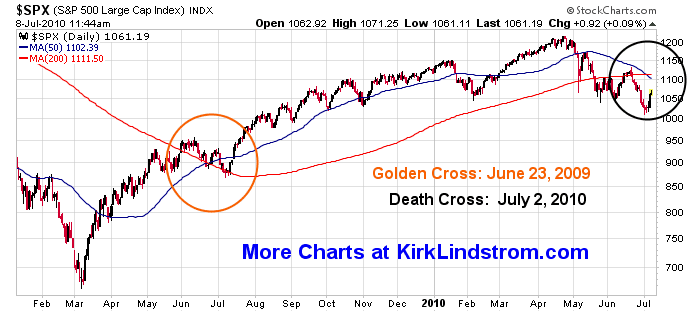
Despite the "Death Cross" in the S&P500, as of today we have heard of no change in ECRI's economic outlook of a slowdown without a double dip recession as we reported at ECRI Weekly Leading Indicators Widely Misunderstood.
Chart showing recent "Death Cross" for the S&P500:
Chart showing recent "Death Cross" for the S&P500:

Click chart for full size image
The Economic Cycle Research Institute, ECRI - a New York-based independent forecasting group, released their latest readings for their proprietary Weekly Leading Index (WLI) this morning. (More about ECRI)
For the week ending July 16, 2010
- WLI stood at 120.7, unchanged from the prior week which was originally reported at 120.6
- WLI growth fell to minus 10.5 percent from minus 9.8 percent a week ago, its lowest level since May 15, 2009, when it stood at minus 11.1 percent.

Click chart for full size image
Which way do you think the Market and WLI will go? With the stock market up this week, the odds are good that WLI will be higher next Friday.

Click chart for full size image
Make sure you read:
Disclosure: I am long SPY (charts & quote) in my personal account and in the "Explore Portfolio" in "Kirk Lindstrom's Investment Letter."
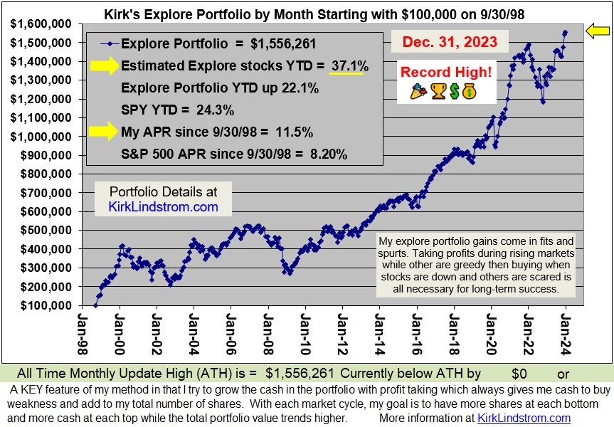
Since 12/31/98 "Kirk's Newsletter Explore Portfolio" is UP 152% (a double plus another 52%!!) vs. the S&P500 UP a tiny 1.4% vs. NASDAQ down 3.8%!!! (All through 6/30/10 )
In 2009, "Kirk's Newsletter Explore Portfolio" gained 33.5% vs. the DJIA up 18.8%
For 2010, as of 7/23/10, the explore portfolio is up 3.5% YTD
vs. DJIA down 0.0% vs. S&P500 down 0.1%!
For 2010, as of 7/23/10, the explore portfolio is up 3.5% YTD
vs. DJIA down 0.0% vs. S&P500 down 0.1%!
- Subscribe NOW and get the July 2010 Issue for FREE! !
- Your 1 year, 12 issue subscription will start with next month's issue.



 Posts
Posts


 kirklindstrom.com
