
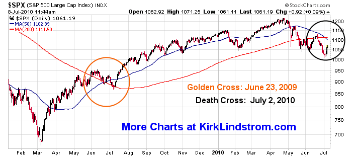
On Friday July 2, 2010 the chart of the S&P500 made a bearish "death cross" where its 50-day moving average, MA(50) broke below its 200-day moving average MA(200).

click for full sized chart
July 2, 2010 Data
- S&P500 Closing Value = 1022.58
- S&P500 MA(50) = 1,111.66
- S&P500 MA(200) = 1,111.74
- Definition of Death Cross Pattern
This "death cross" for the S&P500, last occurred between the 50- and 200-day moving averages in December 2007, shortly after the beginning of the market decline that eventually took the S&P 500 to 12-year lows in March 2009.
One of the simplest trend following models says BUY when the S&P500 makes a "golden cross" where the 50 DMA crosses above its 200 DMA then SELL when the "death cross" occurs. This model worked well the last time there was a death cross.
WARNING: Not all death crosses signal a new bear market and some occurred after the bottom was made. Another problem with this sort of "system" is markets that are range bound can give many signals so you end up selling low and buying high over and over.
For example, the death cross system missed the 1987 bear market, went to cash near the lows but after the bottom in 1987, got back in at a higher level in mid 1988 then lost more ground to "buy and hold" through whip-saw action between 1990 and 1991.

click for full sized charts
Most recent crossings:

More:
More:


 kirklindstrom.com

No comments:
Post a Comment