
This chart shows the US Federal Funds Rate vs. the US stock market index values from 1993 through today. The next three charts show the Dow, S&P 500, Nasdaq and Russell 2000 indexes over the same period. The final chart shows US Treasury interest rates from 1994 through today.

end
 |
| US Stock Markets (Log Scale) vs. Fed Funds Rate |
 |
| DJIA chart showing Irrational Exuberance & Pessimism on a log scale |
 |
| S&P 500 Intraday Prices - Log Scale |
 |
| Nasdaq Composite - Intraday log chart |
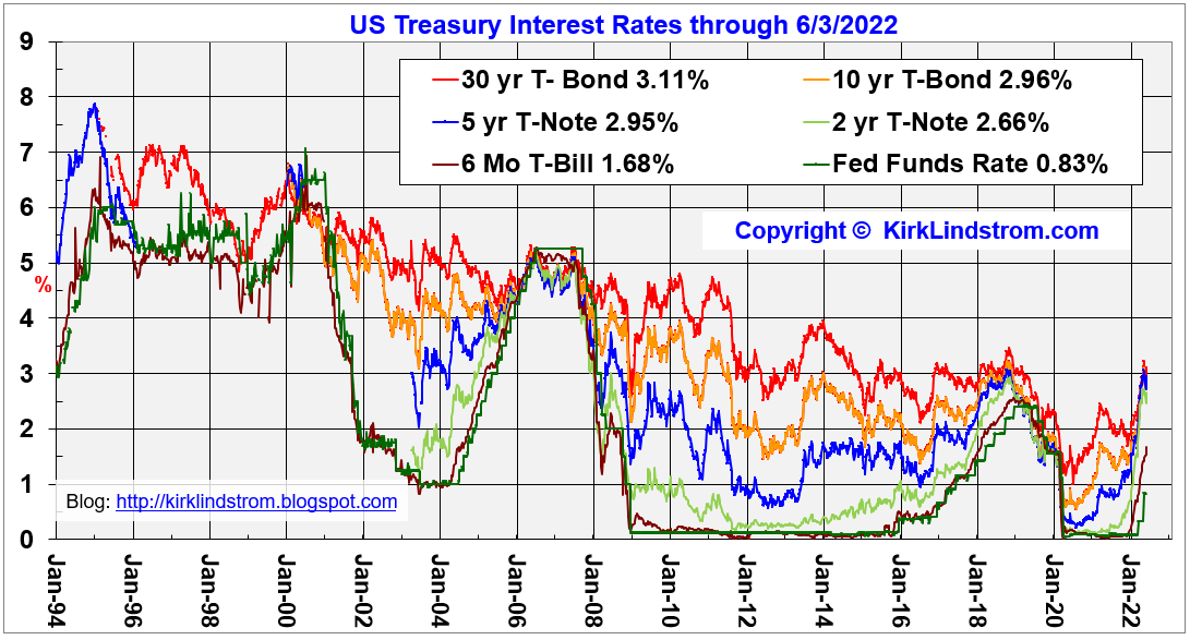 |
| US Treasury interest rates |

Kirk Lindstrom's Investment Letter
Subscribe NOW and get
the May 2022 Issue for FREE!!!
the May 2022 Issue for FREE!!!
More Articles by Kirk Lindstrom:
end


 kirklindstrom.com

No comments:
Post a Comment