Don't Miss Out On Great Gains! - Best Investment Newsletter


Click for FREE sample of Kirk Lindstrom's Investment Letter

Don't miss out! Subscribe Now

google.com, pub-7001134751860982, DIRECT, f08c47fec0942fa0

Search For More

Friday, July 30, 2010

ECRI's WLI Up but Growth Rate Still Falls

The Economic Cycle Research Institute, ECRI - a New York-based independent forecasting group, released their latest readings for their proprietary Weekly Leading Index (WLI) this morning. (More about ECRI)
For the week ending July 23, 2010
  • WLI  stood at 121.1, up from the prior weeks reading of 120.6
  • WLI growth fell to minus 10.7 percent from minus 10.5 percent a week ago
Chart of WLI and WLI growth vs GDP Growth
Click to view full size chart
Since ECRI releases their WLI numbers for the prior week and the stock market is known in real time, you can often get a clue for next week's WLI from the weekly change in the stock market. 

Chart of WLI vs S&P500
 Click to view full size chart
The stock market should finish this week up.  Post your guesses for WLI and WLI growth for next week in the comments section plus your reason why.  (example, WLI up + WLI growth up.  Reason, Bernanke dropped dollars from a helicopter this week.)

Notes: 
  1. The WLI for the week ending 7/30/10 will be released on 8/6/10.
  2. Occasionally the WLI level and growth rate can move in different directions, because the latter is derived from a four-week moving average.
Before you claim understanding of ECRI's WLI, make sure you read the article  "ECRI Weekly Leading Indicators Widely Misunderstood."
"Bottom line, neither the “experts” predicting that the sky is falling based on the WLI, nor the other “experts” indulging in misinformed WLI-bashing in an effort to discredit the super-bears, have a real clue to what the WLI is all about...  A slowdown in U.S. economic growth is imminent, but a new recession is not." 
Disclosure:  I am long SPY (charts & quote) in my personal account and in the "Explore Portfolio" in  "Kirk Lindstrom's Investment Letter."


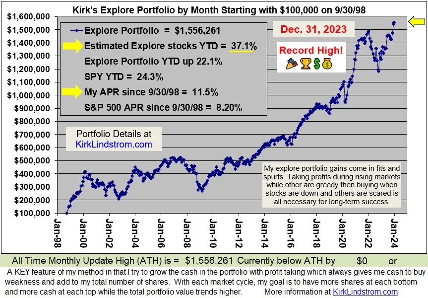
Since 12/31/98 "Kirk's Newsletter Explore Portfolio" is UP 152% (a double plus another 52%!!) vs. the S&P500 UP a tiny 1.4% vs. NASDAQ  down 3.8%!!!   (All through 6/30/10)


In 2009, "Kirk's Newsletter Explore Portfolio" gained 33.5% vs. the DJIA up 18.8%
For 2010, as of 7/26/10, the explore portfolio is up 4.5% YTD
vs. DJIA 
up 0.6% YTD vs. S&P500 up 0.7% YTD
  • Subscribe NOW and get the July 2010 Issue for FREE!   
  • Your 1 year, 12 issue subscription will start with next month's issue.


Friday, July 23, 2010

ECRI WLI Growth Rate + S&P500 Death Cross

Despite the "Death Cross" in the S&P500, as of today we have heard of no change in ECRI's economic outlook of  a slowdown without a double dip recession as we reported at ECRI Weekly Leading Indicators Widely Misunderstood.

Chart showing recent "Death Cross" for the S&P500:

 Click chart for full size image

The Economic Cycle Research Institute, ECRI - a New York-based independent forecasting group, released their latest readings for their proprietary Weekly Leading Index (WLI) this morning. (More about ECRI)

For the week ending July 16, 2010
  • WLI  stood at 120.7, unchanged from the prior week which was originally reported at 120.6
  • WLI growth fell to minus 10.5 percent from minus 9.8 percent a week ago, its lowest level since May 15, 2009, when it stood at minus 11.1 percent.
This is a chart of the S&P500 (charts + Quote) vs ECRI's WLI from October 1, 2004 through July 23, 2010. 

 Click chart for full size image

Which way do you think the Market and WLI will go? With the stock market up this week, the odds are good that WLI will be higher next Friday.

Click chart for full size image

Make sure you read:
Disclosure:  I am long SPY (charts & quote) in my personal account and in the "Explore Portfolio" in  "Kirk Lindstrom's Investment Letter."


Since 12/31/98 "Kirk's Newsletter Explore Portfolio" is UP 152% (a double plus another 52%!!) vs. the S&P500 UP a tiny 1.4% vs. NASDAQ  down 3.8%!!!   (All through 6/30/10)


In 2009, "Kirk's Newsletter Explore Portfolio" gained 33.5% vs. the DJIA up 18.8%
For 2010, as of 7/23/10, the explore portfolio is up 3.5% YTD
vs. DJIA 
down 0.0% vs. S&P500 down 0.1%!
  • Subscribe NOW and get the July 2010 Issue for FREE!   
  • Your 1 year, 12 issue subscription will start with next month's issue.

ECRI WLI vs S&P500 and GDP Growth

ECRI's WLI Flat While its Growth Rate Falls
The Economic Cycle Research Institute, ECRI - a New York-based independent forecasting group, released their latest readings for their proprietary Weekly Leading Index (WLI) this morning. (More about ECRI)
For the week ending July 16, 2010
  • WLI  stood at 120.7, unchanged from the prior week which was originally reported at 120.6
  • WLI growth fell to minus 10.5 percent from minus 9.8 percent a week ago, its lowest level since May 15, 2009, when it stood at minus 11.1 percent.
This is a chart of the S&P500 (charts + Quote) vs ECRI's WLI from October 1, 2004 through July 23, 2010. 
 Click chart for full size image
This is a chart of ECRI's WLI and WLI growth rate vs. GDP growth from October 1, 2004 through July 23, 2010.
  Click chart for full size image

Data for week ending July 16, 2010:

Indexes       Period   Level  Growth
WLI, Weekly  7/16/10   120.7  -10.5%
WLI, Monthly    6/10   121.1   -7.1%
Note: The WLI for the week ending 7/23/10 will be released on 7/30/10.

 Disclosure:  I am long SPY (charts & quote) in my personal account and in the "Explore Portfolio" in  "Kirk Lindstrom's Investment Letter."
Since 12/31/98 "Kirk's Newsletter Explore Portfolio" is UP 152% (a double plus another 52%!!) vs. the S&P500 UP a tiny 1.4% vs. NASDAQ  down 3.8%!!!   (All through 6/30/10)

In 2009, "Kirk's Newsletter Explore Portfolio" gained 33.5% vs. the DJIA up 18.8%
For 2010, as of 7/23/10, the explore portfolio is up 3.5% YTD
vs. DJIA 
down 0.0% vs. S&P500 down 0.1%!
  • Subscribe NOW and get the July 2010 Issue for FREE!   
  • Your 1 year, 12 issue subscription will start with next month's issue.
More Information:

    Friday, July 16, 2010

    Equity, Bond & Money Market Fund Flows Weekly Report

    Money continues to pour into bond funds.
    Annual data shown in table 1 below. 
    Weekly 07/14/2010 
    • Equity Fund Inflows $4.7 Bil
    • Taxable Bond Fund Inflows $6.2 Bil
    • xETFs - Equity Fund Inflows $117 Mil
    • Taxable Bond Fund Inflows $4.1 Bil
    Fund Flow Totals for 2010 through 7/14/10
    Table 1 AMG Fund Flows for Full Year - $B
    Fund Flows for Equity Tax Bond MM Fund
    2003 40.8 40.7 NC
    2004 95.0 11.3 (64.3)
    2005 71.9 9.3 89.0
    2006 52.5 29.9 308.3
    2007 111.3 68.8 569.5
    2008 3.5 (3.3) 608.0
    2009 6.0 172.0 (280.2)
    2010 (17.3) 89.7 (399.9)
    • NC = Data Not Compiled
    •  += Some data for Money Market Funds between March 2010 and July 14, 2010 is missing but the overall trend is clear. 
    • Raw data from AMG Weekly Fund Flows Data
    ExETFs—For the week ended 7/14/2010 all Equity funds report net inflows totaling $0.117 billion as Domestic Equity funds report net outflows of $0.007 billion and Non-Domestic Equity funds report net inflows of $0.124 billion... ExETFs—Emerging Markets Equity funds report net inflows of $0.186 billion as investors continue to look outside the US and developed European markets… Net inflows are reported for All Taxable Bond funds (+$6.205 billion), bringing the rate of inflows of the $1.098-trillion sector to $3.351 billion/week... International & Global Debt funds ($0.628 billion) continued to draw assets as they reported inflows for the seventh consecutive week... Net inflows of $2.104 billion were reported for Corp-Investment Grade funds... Money Market funds report net inflows of $2.853 billion... ExETFs—Municipal Bond funds report net inflows of $0.612 billion.... The database was updated a second time today to reflect a large batch of fund mergers during the week, which originally overstated Municipal Bond funds flows.

    Rydex Nova/Ursa Ratio = 0.262
    This chart of the "Rydex Nova/Ursa Ratio" courtesy of Schaeffer's Research shows money is flowing into bear (Ursa) funds at nearly four times the rate of bull funds (ratio is 0.262 for 7/14)
    Date NAV Adjusted N/U Ratio
    07/15 0.260
    07/14 0.262
    07/13 0.262
    07/12 0.248
    07/09 0.236

    Since 12/31/98 "Kirk's Newsletter Explore Portfolio" is UP 152% (a double plus another 52%!!) vs. the S&P500 UP a tiny 1.4% vs. NASDAQ  down 3.8%!!!   (All through 6/30/10)
    In 2009, "Kirk's Newsletter Explore Portfolio" gained 33.5% vs. the DJIA up 18.8%
    For 2010, as of 7/15/10, the explore portfolio is up 2.3% YTD
    vs. DJIA 
    down 0.7% vs. S&P500 down 0.7%!

    Subscribe NOW and get the July 2010 Issue for FREE!  


    Friday, July 09, 2010

    Best CD Rate Survey


    The top CD annal percentage yield (APY) this week is at Pentagon Federal Credit Union for a 7-year certificate of deposit currently paying 3.51%.   From my survey of six months ago, this same certificate was paying 4.5%! 


    The table below shows the best CD rates for other terms. If that table is hard to read, then try Very Best CD Rates.
    "Highest CD Rate Survey + Current US Treasury Rates"

    Term
    Highest
    Rate (APY)
    Where?
    (Click link for Full Rate Sheets)
    Vanguard Daily
    0.09%
    Vanguard Prime Money Market Fund
    Vanguard Tax Exempt
    0.11%
    Vanguard Tax Exempt Money Market Fund
    FDIC Daily Savings
    1.40%
    Best Savings Account Rate Survey 
    6 Month CD
    1.23%
    Aurora Bank 
    1 Year CD
    1.55%
    Sallie Mae Bank & 1.50%@ Discover Bank 
    1 Yr US Treasury
    0.29%
    US Treasury Rate Quote
    18 - Month CD
    1.71%
     Aurora Bank 
    2 Year CD
    2.00%
    Stonebridge Bank & Bank of Internet USA
    3 Year CD
    2.50%
     newDominionDIRECT 
    4 Year CD
    2.92%
     Bank of Internet USA
    5 Year CD
    3.06%
    Astoria Federal Savings Bank
    5 Yr US Treasury
    1.83%
    US Treasury Rate Quote
    7 Year CD
    3.51%
    Pentagon Federal CU aka PenFed 
    10 Year CD
    3.50%
    Discover Bank
    10 Yr US Treasury
    3.04%
    US Treasury Rate Quote
    Vanguard Money Market Rates shown for Reference  

    With rates so low, banks will try to sell you their annuity products. Make sure you read my article: Beware of Annuities

    Historical CD Rates: 
    Click charts to see full size images


    1-Month CD Daily Chart
    6-Month Certificate of Deposit Historical Chart
    6-Month CD Daily Chart
    6-Month Certificate of Deposit Historical Chart

    Related information:

    Tuesday, July 06, 2010

    Death Cross for S&P500 - Chart & Values

    On Friday July 2, 2010 the chart of the S&P500 made a bearish "death cross" where its 50-day moving average, MA(50) broke below its 200-day moving average MA(200). 
    click for full sized chart
    July 2, 2010 Data
    This "death cross" for the S&P500, last occurred between the 50- and 200-day moving averages in December 2007, shortly after the beginning of the market decline that eventually took the S&P 500 to 12-year lows in March 2009. 
    One of the simplest trend following models says BUY when the S&P500 makes a "golden cross" where the 50 DMA crosses above its 200 DMA then SELL when the "death cross" occurs.    This model worked well the last time there was a death cross. 

    WARNING: Not all death crosses signal a new bear market and some occurred after the bottom was made. Another problem with this sort of "system" is markets that are range bound can give many signals so you end up selling low and buying high over and over.

    For example, the death cross system missed the 1987 bear market, went to cash near the lows but after the bottom in 1987, got back in at a higher level in mid 1988 then lost more ground to "buy and hold" through whip-saw action between 1990 and 1991.

    click for full sized charts
    Most recent crossings:


    More:

    Thursday, July 01, 2010

    ECRI Weekly Leading Indicators Widely Misunderstood

    Article by ECRI's Lakshman Achuthan and Anirvan Banerji. ECRI is an independent institute dedicated to economic cycle research in the tradition established by its founder, Geoffrey H. Moore, whom The Wall Street Journal called "the father of leading indicators." Read "More about ECRI."

    There’s been much attention to our work of late, culminating in a report this Tuesday from Bank of America listing several critiques of our Weekly Leading Index (WLI). Apparently, the clinching argument is that “If a single indicator always accurately predicted the trajectory of the economy, the demand for Wall Street economists would be significantly reduced.”
    To some Wall Street economists, it may seem self-evident that there should be strong demand for their views. But this is not at all clear to us as far as their recession-forecasting function is concerned. After all, a 63-country IMF study on economists’ recession-forecasting prowess concluded that “The record of failure to predict recessions is virtually unblemished.” In contrast, the IMF subsequently noted that ECRI “has actually had a very stellar record” of recession forecasting.

    As we outlined in our 2004 book, Beating the Business Cycle, there is no Holy Grail of economic forecasting, even among our large array of state-of-the-art leading indexes, of which the WLI is but one. It seems that many of the self-styled experts on the WLI either haven’t read the book, or simply don’t understand the parts of the book where we repeatedly state, in no uncertain terms, that ECRI does not use models.
    We aren’t entirely surprised. Virtually the entire analytical community has been trained to believe that any and all quantitative approaches to forecasting must involve models, i.e., simplified representations of reality. The idea that there could be rigorous quantitative approaches that are not model-based seems to be entirely beyond their ken. Their understanding of analytical techniques is so model-soaked that it reminds us of an insightful comment from psychologist Daryl Bem: “It takes a very intelligent and non-parochial fish to realize that his environment is wet.”
    So it is with economists who cannot imagine that ECRI’s leading indexes are not model-driven or based on back-fitting of data. Thus the BofA report notes that “the ECRI (sic) and other leading indexes . . . fit the business cycle better ex post than ex ante” and that “This is an example of a broader issue in all statistical models of the economy. The data fit much better in-sample than out-of-sample.”
    They just don’t get it. While this may be a valid criticism of statistical models of the economy, ECRI’s leading indexes are not, in any sense, statistical models of the economy.
    BofA’s ignorance of the facts continues in their use of a 1993 (yes, 1993!) Dallas Fed study of the Commerce Department’s LEI to impugn the WLI. The Fed paper correctly points out that the-then LEI got revised a lot — a situation that hasn’t changed now that the Conference Board maintains the index. However, none of what the Fed reviewed in 1993 had anything to do with the WLI, which is the target of the current BofA report.
    Furthermore (not that we’re fans of the Conference Board’s LEI) but the Dallas Fed study may not be valid in the first place, since the results are based on a Bayesian model chosen by the Dallas Fed to generate recession and recovery signals from the LEI. In other words, it isn’t clear whether failures highlighted in that report have to do with the LEI itself or the assumptions and the specifications of the Bayesian model used in that study.
    Still, the BofA’s latest forecast of a “recovery, stronger than what we saw in the early 2000s and 1990s, but weaker than V-shaped recovery in the early 1980s” is very much in line with what ECRI predicted — in August 2009. At that time, we said the recovery would be “at a stronger pace than any the United States has seen since the early 1980s.”
    BofA’s parroting of our forecast from late last summer reminds us of Jon Stewart’s segment on Nowcasting where experts describe something that’s already happening as though it’s coming (Jason Jones starts at three-minute mark).
    Bottom line, neither the “experts” predicting that the sky is falling based on the WLI, nor the other “experts” indulging in misinformed WLI-bashing in an effort to discredit the super-bears, have a real clue to what the WLI is all about. We created the WLI not to be an infallible, stand-alone recession-forecasting machine, but as one small part of a much larger array of leading indexes (each made up of many economic indicators) — like the especially prescient U.S. Long Leading Index. This array amounts to a sophisticated sequential signaling system of the economy’s cyclical turning points. The WLI is designed to be interpreted in this broader context, and its message today is quite simple: A slowdown in U.S. economic growth is imminent, but a new recession is not.

    Click to View Full Sized Image


    Book: Beating The Business Cycle
    ..

    DOW Stocks YTD at end of First Half 2010

    Of the Major indexes, the S&P500 had the worst first half with a 7.6% loss while the Russell 2000 "only" lost 2.5%.  The Dow Jones Industrial Average or "DOW" is down 6.3% YTD.

    Name Ticker 6/30/10 YTD
    Dow Jones Industrial Average Index  $DJI  $9,774.02 (6.3%)
    S&P 500 INDEX  $INX $1,030.71 (7.6%)
    NASDAQ Composite Index  $COMPX $2,109.24 (7.0%)
    RUSSELL 2000 INDEX  $RUT.x $609.49 (2.5%)

    With a year-to-date (YTD) gain of 15.9%, Boeing (BA) was the best performing stock in the DOW. Alcoa (AA) is at the bottom of the list with a YTD loss of 37.6%.

    The following table ranks the performance of the 30 DOW stocks from best to worst.

    Rank Name Ticker 6/30/10 YTD
    1 Boeing Co  BA $62.75 15.9 %
    2 McDonald's Corp  MCD $65.87 5.5 %
    3 Caterpillar Inc  CAT $60.07 5.4 %
    4 Kraft Foods Inc  KFT $28.00 3.0 %
    5 Du Pont de Nemours & Co  DD $34.59 2.7 %
    6 Procter & Gamble Co  PG $59.98 (1.1%)
    7 Travelers Companies Inc  TRV $49.25 (1.2%)
    8 American Express Co  AXP $39.70 (2.0%)
    9 Walt Disney Co  DIS $31.50 (2.3%)
    10 Home Depot Inc  HD $28.07 (3.0%)
    11 Merck & Co Inc  MRK $34.97 (4.3%)
    12 3M Co  MMM $78.99 (4.5%)
    13 Bank of America Corp  BAC $14.37 (4.6%)
    14 Intel Corp  INTC $19.45 (4.7%)
    15 General Electric Co  GE $14.42 (4.7%)
    16 International Business Machines  IBM $123.48 (5.7%)
    17 United Technologies Corp  UTX $64.91 (6.5%)
    18 Johnson & Johnson  JNJ $59.06 (8.3%)
    19 Wal-Mart Stores Inc  WMT $48.07 (10.1%)
    20 Cisco Systems Inc  CSCO $21.31 (11.0%)
    21 Chevron Corp  CVX $67.86 (11.9%)
    22 Coca-Cola Co  KO $50.12 (12.1%)
    23 JP Morgan Chase & Co  JPM $36.61 (12.1%)
    24 AT&T Inc  T $24.19 (13.7%)
    25 Verizon Communications Inc  VZ $28.02 (15.4%)
    26 Hewlett-Packard Co  HPQ $43.28 (16.0%)
    27 Exxon Mobil Corp  XOM $57.07 (16.3%)
    28 Pfizer Inc  PFE $14.26 (21.6%)
    29 Microsoft Corp  MSFT $23.01 (24.5%)
    30 Alcoa Inc  AA $10.06 (37.6%)
    Note, Price Performance does not include dividends.

    Disclosure:  My personal portfolio is currently long GE, HPQ, INTC, IBM, MSFT & PFE.  Also, the "Explore portfolio" in "Kirk Lindstrom's Investment Letter" is currently long GE, INTC, IBM,M SFT & PFE.

    Followers - Click "follow" to get an email alert for new articles

    Kirk Lindstrom's Investment Letter Performance