Don't Miss Out On Great Gains! - Best Investment Newsletter


Click for FREE sample of Kirk Lindstrom's Investment Letter

Don't miss out! Subscribe Now

google.com, pub-7001134751860982, DIRECT, f08c47fec0942fa0

Search For More

Showing posts with label Resistance and Support Charts. Show all posts

Wednesday, August 06, 2014

Russell 2000 Resistance Support Charts with Correction Statistics

The current correction for the Russell 2000 shows the peak decline from its recent all-time record high, so far, was 10.8%.  Currently the Russell 2000 is  7.6% below the all-time record high.


Intraday "Correction" Statistics for Russell 2000 as of 08/06/14
More Russell 2000 charts and Quote
Last Market High 07/01/14 at 1,213.55
Last Market low 08/01/14 at 1,082.53
Current R2000 Price 1,121.56
Decline in Points = 91.99
Decline in percent = 7.6%
Max Decline = 10.8%
=>This means the decline from intraday high to intraday low is 10.8% and we are currently 0.075802398 7.6% off the peak.


From ChartoftheDay.com
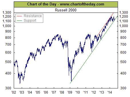
For some perspective on the current state of the stock market, today's chart presents the long-term trend of the Russell 2000 (small-cap stocks). As the chart illustrates, the Russell 2000 rallied from late 2002 into the mid-2007 and then effectively gave all of that back during the financial crisis. Since the financial crisis, the Russell 2000 has been rallying sharply to the upside (with the exception of a brief "fiscal cliff" induced selloff in November 2012). Since early March 2014, however, the Russell 2000 has moved significantly to the downside and is now testing support of its upward sloping, post-financial crisis trend channel.
My Recent FREE Seeking Alpha articles:

S&P500 Correction Statistics with Resistance and Support Levels

The current correction for the S&P500 shows the peak decline, so far, was 4.0% and we are currently 3.7% below the all-time record high.

Intraday "Correction" Statistics for 08/06/14
S&P500 ChartLast Market High 07/24/14 at 1,991.39
Last Market low 08/06/14 at 1,911.45
Current S&P500 Price 1,917.86
Decline in Points = 73.53
Decline in percent = 3.7%
Max Decline = 4.0%
  • =>This means the decline from intraday high to intraday low is 4.0% and we are currently 3.7% off the peak.


These charts show the next major support levels are:
  1. The dashed blue line just above 1880
  2. The 200 DMA (day moving average) currently at 1861.06
    Note that a correction to the 200DMA would be roughly 7% below the record high.
  3. The dashed green line currently just below a 10% correction from the record high.


My Recent FREE Seeking Alpha articles:

Wednesday, June 11, 2014

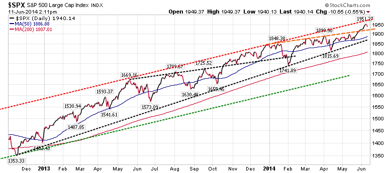
Support & Resistance Levels for the S&P500

It would be really healthy for the market to test the breakout of the dashed orange lines from above.  This would be about 1,930.
Note that this second chart shows  a similar break above a trend line in October 2013 that was tested from above once in November 2013 before the market rallied all the way up to the dashed red resistance line.
Support Levels for S&P500
  1. About 1930
  2. The 50 DMA (day moving average) currently at 1887
  3. The dashed black trend line at about 1825
  4. The 200 DMA currently at 1807
Resistance Levels for S&P500
  1. About 1975
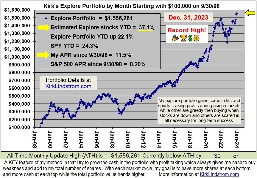
Currently my portfolios are at record all-time highs.  I've taken some profits and have plenty of cash to buy any major declines yet I am "fully invested" to take advantage if (when) the market goes higher.

Learn the "Core and Explore" approach to investing
with "Kirk Lindstrom's Investment Letter"
Subscribe NOW and get the June 2014 Issue for FREE!   
(Your 1 year, 12 issue subscription will start with next month's issue.)
(More Info
Testimonials Portfolio Returns)
See my just published article: 
Note how the DOW remains below its long-term trend lines.

Is it too late to buy stocks? No! It is hard to believe how many individual investors are still under invested in stocks.  Two bear markets that took the S&P500 down over 50% each time between 2000 and 2009 scared many into cash and bonds.  Most are only starting to get back into stocks. The fear may take a generation, or at least 20 years, for investors to return to "proper asset allocations." 

  • You can pay for the newsletter for a year with one successful Explore Portfolio trade and then follow the core portfolios essentially for free.
Note, you can do great just following my core portfolios by reading pages 1 to 12 each month of my newsletter and ignoring the rest that covers individual stocks.  The price is still better than competitive "mutual fund newsletters" that don't have the same long-term, documented (see attachment) performance.  

Tuesday, October 29, 2013

Watch the Red Lines - Market Resistance & Support Graphs

Resistance and Support Levels for the Dow & S&P500 

The exchange traded funds (ETF) for the Dow and S&P500 are DIA and SPY, respectively. 

My chart below shows the Dow and S&P500 as indexes and the ETFs with dividends reinvested.  


Notes: 
  • DIA, with dividends reinvested, seems to be forming a base after testing support from above.
  • The S&P500, $SPX in the graph, is above resistance turned support.  That line would be the first level of strong support if there is any further market weakness.
  • The NASDAQ is above a 19-year support-turned-resistance-back-to-support line that was resistance for 11 years.  Below is a blow-up of the NASDAQ graph.
Check out these results:
"Newsletter Explore Portfolio"
and get the October 2013 Issue for FREE!!

Followers - Click "follow" to get an email alert for new articles

Kirk Lindstrom's Investment Letter Performance