Don't Miss Out On Great Gains! - Best Investment Newsletter


Click for FREE sample of Kirk Lindstrom's Investment Letter

Don't miss out! Subscribe Now

google.com, pub-7001134751860982, DIRECT, f08c47fec0942fa0

Search For More

Showing posts with label Technical Analysis. Show all posts

Wednesday, June 11, 2014

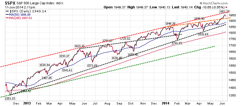
Support & Resistance Levels for the S&P500

It would be really healthy for the market to test the breakout of the dashed orange lines from above.  This would be about 1,930.
Note that this second chart shows  a similar break above a trend line in October 2013 that was tested from above once in November 2013 before the market rallied all the way up to the dashed red resistance line.
Support Levels for S&P500
  1. About 1930
  2. The 50 DMA (day moving average) currently at 1887
  3. The dashed black trend line at about 1825
  4. The 200 DMA currently at 1807
Resistance Levels for S&P500
  1. About 1975
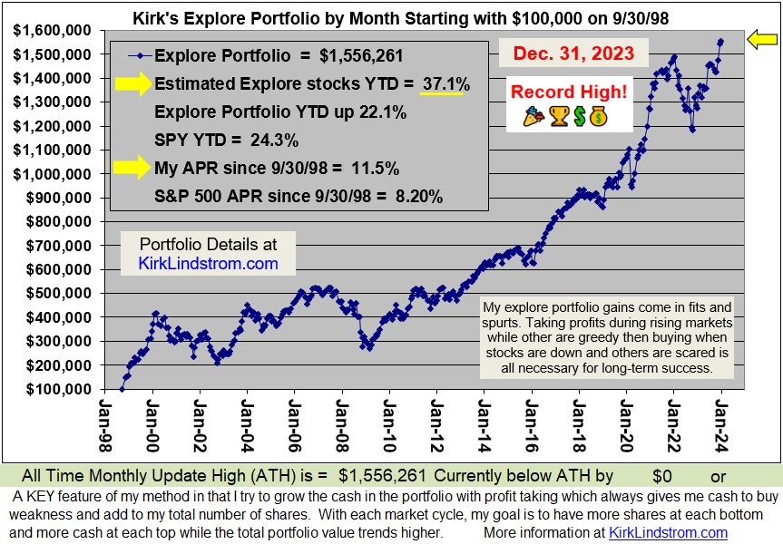
Currently my portfolios are at record all-time highs.  I've taken some profits and have plenty of cash to buy any major declines yet I am "fully invested" to take advantage if (when) the market goes higher.

Learn the "Core and Explore" approach to investing
with "Kirk Lindstrom's Investment Letter"
Subscribe NOW and get the June 2014 Issue for FREE!   
(Your 1 year, 12 issue subscription will start with next month's issue.)
(More Info
Testimonials Portfolio Returns)
See my just published article: 
Note how the DOW remains below its long-term trend lines.

Is it too late to buy stocks? No! It is hard to believe how many individual investors are still under invested in stocks.  Two bear markets that took the S&P500 down over 50% each time between 2000 and 2009 scared many into cash and bonds.  Most are only starting to get back into stocks. The fear may take a generation, or at least 20 years, for investors to return to "proper asset allocations." 

  • You can pay for the newsletter for a year with one successful Explore Portfolio trade and then follow the core portfolios essentially for free.
Note, you can do great just following my core portfolios by reading pages 1 to 12 each month of my newsletter and ignoring the rest that covers individual stocks.  The price is still better than competitive "mutual fund newsletters" that don't have the same long-term, documented (see attachment) performance.  

Friday, July 17, 2009

New Support Levels for the S&P500 are Holding

I show two support Levels for the S&P500 on the graph below.

Click chart courtesy of stockcharts.com for full size image

#1 200-day-moving-average MA(200) was solid resistance not penetrated since May 2008. Now it is support that has been tested several times from above before the last rally.

#2 The dashed green line on the chart is the neckline of an inverted head and shoulders bottom pattern. One shoulder is "somewhat hidden" as only some components of the S&P500 were weak while others were quite strong. The pattern broke out in May and has successfully tested the neckline from above. All we need now is a rally with volume to feel very bullish.

If you have trouble seeing the inverted head and shoulder's bottom, perhaps this chart of FedEx (more FDX Charts) will make it easier.


Disclaimer: I currently personally own and I cover FDX and SPY in "Kirk Lindstrom's Investment Letter" where I currently have both in my explore portfolio.

Doubled Money in a Down Market!

Since 12/31/98 "Kirk's Newsletter Explore Portfolio" is UP 114% (over a double!) vs. the S&P500 DOWN 9.2% vs. NASDAQ down 14.0% vs. Warren Buffett's Berkshire Hathaway (BRKA) up 28.1% (All through 7/16/09.)

As of July 16, 2009, "Kirk's Newsletter Explore Portfolio" is up 10.2% YTD vs. DJIA down 0.7% vs S&P500 up 5.7% YTD

HURRY! Subscribe NOW and get the July 2009 Issue for FREE! !
(Your 1 year, 12 issue subscription will start with next month's issue.)

Friday, September 05, 2008

$80 Oil? Inflation Adjusted Gasoline and Oil Charts Suggest Odds are Good

The graphs of inflation-adjusted gasoline prices and the price of oil (more oil charts) below are good news for the global economy. Prices for both gasoline and oil could continue to fall as the global economy slows. The best news is technical analysis indicates the prices of oil could fall a lot more, perhaps into the $70s if the "Head-and-Shoulders Top" reversal pattern now in play resolves to its price target.

Chart courtesy of www.chartoftheday.com

The chart below of oil prices vs the S&P500 shows the price of oil has completed a "Head-and-shoulders reversal," very important reversal pattern for those who practice technical analysis.

If you look closely at the above chart of oil prices, you can see two head-and-shoulder (H&S) patterns have formed what I've coined a "compound head-and-shoulders pattern." A compound H&S patterns in one H&S pattern inside another. I show the neckline for H&S#1 at $121. You can see this neckline breakdown was tested from below while forming the right shoulder of a second H&S pattern with a neckline at $111.

A reason to be bearish on the price of oil (expect declines to continue) is three key support levels have been broken. These are:
  1. H&S #1 at $121
  2. H&S #2 at $111
  3. The 18 month uptrend support (dashed blue) line also at about $111.
The H&S patterns project oil will drop into the $70s and $80s while the point-and-figure chart projects $96, a good 10% lower than were oil was yesterday at the close.

More on "Head-and-Shoulders" chart patterns


The Bible for technical analysis, Technical Analysis of Stock Trends, by Robert Edwards and John Magee, covers the "Head-and-Shoulders" chart pattern in Chapter six (starting on pg 59)

Note, "Edwards and Magee" states the neckline has to be broken for the reversal pattern to be in play with the target price. They say about 20% of patterns break the neckline with the proper volume attributes, flounder about for a bit, then return to higher levels to negate the reversal pattern.

As with all Technical Analysis, it would be a science rather than an art if the patterns were 100% reliable.

Conclusion:

Today the economy is suffering from inflation from high oil prices plus an economic slowdown in large part due to higher energy costs sucking spending power from consumers and business owners. This has thrown the market averages into bear markets.
If oil prices continue lower to to $70s, $80s or $90s, then consumers and business owners will have more to spend. If the credit markets can work out their issues, then consumers and business owners will have access to low cost money again too. More money to spend should help the markets recover in the long term. Thus, I've been using these major sell-offs as time to add to equities in my "newsletter explore portfolio" and my personal portfolio too. While writing this article, I added to one of the stocks covered in my newsletter. I bought just minutes after I got word from a program that monitors the SEC that two insider buys were made on a stock I wanted more of.

Tuesday, January 29, 2008

DJIA Monthly Chart Getting More Bullish

Click chart courtesy of stockcharts.com to see full sized

This chart shows the DJIA pulled back to the 61.8% Fibonacci level which was ALSO the old 2004 to 2006 resistance level.

In bull markets, breakouts of resistance levels that become support are healthy. When they correspond to a Fibonacci retrace, all the better.

IF the month can finish near where it started, then we will also have a very bullish “Dragon Fly Doji.” From Stockcharts.com:
Dragon fly doji form when the open, high and close are equal and the low creates a long lower shadow. The resulting candlestick looks like a "T" with a long lower shadow and no upper shadow. Dragon fly doji indicate that sellers dominated trading and drove prices lower during the session. By the end of the session, buyers resurfaced and pushed prices back to the opening level and the session high.

The reversal implications of a dragon fly doji depend on previous price action and future confirmation. The long lower shadow provides evidence of buying pressure, but the low indicates that plenty of sellers still loom. After a long downtrend, long black candlestick, or at
support, a dragon fly doji could signal a potential bullish reversal or bottom. After a long uptrend, long white candlestick or at resistance, the long lower shadow could foreshadow a potential bearish reversal or top. Bearish or bullish confirmation is required for both situations.

If we can get five or six hundred points in rally before the month closes, we could get a nice looking dragon fly doji. Rally a bit more for an up month and the famed “January Indicator” would also be bullish.

Can we do it in the next three days? Stay tuned…..

Wednesday, January 09, 2008

Arms Index (TRIN) very Bullish for Contrarians at 1.87

The 10-day moving average (10-dma) of the Arms Index ($TRIN) is giving a very bullish signal for us contrarians as these charts below show.


Richard (Dick) Arms developed the TRIN, or Arms index, as a contrarian indicator to detect overbought and oversold levels in the market. Because of its calculation method, the TRIN has an inverse relationship with the market. Generally, a rising TRIN is bearish and a falling TRIN is bullish. Sometimes you will see the scale of the TRIN inverted to reflect this inverse relationship.

A number of TRIN interpretations have evolved over the years. Richard Arms, the originator, uses the TRIN to detect extreme conditions in the market. He considers the market to be overbought when the 10-day moving average of the TRIN declines below .8 and oversold when it moves above 1.2. Other interpretations seek to use the direction and absolute level of the TRIN to determine bullish and bearish scenarios. In the momentum driven markets, the TRIN can remain oversold or overbought for extended periods of time.
As the charts above show, the 10-day moving average of the TRIN is well above 1.2 and has exceeded the very rare area of 1.5 and higher.
If pressed, I would have to say it looks like we could be making a "bottom" very similar to the one made in 2002/2003. The markets might want to "annoy us" and churn here or even go lower to get the AAII bull/bear survey more negative, but this does not look like the end of the bull market to me at all.
Ding.

Saturday, December 01, 2007

Number of New Lows on NYSE above 450


Click to see full sized chart courtesy of stockcharts.com


This chart shows the number of NYSE stocks that are making new 52 week lows (red spikes) plotted with the S&P500 in black. You can see from the chart that spikes above 450 new lows are fairly rare. The chart also shows that buying after these spikes retreat has provided great returns in the short term (2001) and often in the long term (1994, 1998, 2002, 2004 and hopefully now in 2007.)


I believe this chart is more evidence that the market is trying, as odd as it seems near all time highs for the averages, to make a very major bottom similar to the 1998 and 2002/2003 bottoms.

Most really good bottoms before major advances are double or triple bottoms. 1998 was a double bottom and 2002/3 was a triple bottom with two significant lows made in 2002 and a test of those lows, about 4% higher, in 2003.

Also of note is this attempt to make a major bottom is coming on what I call a test of the breakout above the 2000 highs.

The bears will say the market is making a double top before crashing as the market comes apart.

Tuesday, November 13, 2007

Number of New Lows on NYSE above 450

This chart shows the number of NYSE stocks that are making new 52 week lows (red spikes) plotted with the S&P500 in black. You can see from the chart that spikes above 450 new lows are fairly rare. Last Friday (Nov. 9, 2007) the NYSE made a second spike above 450 in just a few months!
Click to see full sized chart courtesy of stockcharts.com

I believe this chart is more evidence that the market is trying, as odd as it seems near all time highs for the averages, to make a very major bottom similar to the 1998 and 2002/2003 bottoms.

Most really good bottoms before major advances are double or triple bottoms. 1998 was a double bottom and 2002/3 was a triple bottom with two significant lows made in 2002 and a test of those lows, about 4% higher, in 2003.

Also of note is this attempt to make a major bottom is coming on what I call a test of the breakout above the 2000 highs.

The bears will say the market is making a double top before crashing as the market comes apart.

Wednesday, October 17, 2007

Bradley Turn Dates for 2008

More info at

From Bradley Turn Dates for 2007, today, 10/17/07, is supposed to be the most important turn date for 2007.

The Bradley siderograph (more information) was developed in the 1940's by Donald Bradley to forecast the stock markets. Bradley assigned numerical values to certain planetary constellations for every day, and the sum is the siderograph. It was originally intended to predict the stock markets. William Eng, a noted technical analyst, singled out the Bradley as the only 'excellent' Timing Indicator in his book, "Technical Analysis of Stocks, Options, and Futures" (source: Astrikos).

These are the eight Bradley Turn Dates for the remainder of 2007 and 2008:

  1. December 22, 2007 (A most important date)
  2. March 8 to March 9, 2008
  3. April 4, 2008
  4. April 27, 2008
  5. May 24, 2008
  6. June 6, 2008 (A most important date)
  7. September 9, 2008
  8. September 20, 2008
  9. December 14, 2008 (A most important date)

Also see: Bradley Turn Dates for 2007.

Two investment newsletters rely heavily on the Bradley Siderograph and their returns are terrible. Mark Hulberts "Hulbert Financial Digest" reports in the "Long Term Performance Ratings through June 30, 2006" the following:
  • "The Crawford Perspective" has an average annual return of only 4.9% since its 12/31/88 inception. If shorting is allowed, the returns are a negative 7.2% while a buy and hold of the Wilshire5000 over the same period yielded an average annual return of +11.5%!
  • Peter Eliades' Stockmarket Cycles has an average annual return of only 4.7% since its 12/31/84 inception while a buy and hold of the Wilshire5000 over the same period yielded an average annual return of +12.4%!

My newsletter has a much better record but I am always interested in new ideas. Click for a FREE SAMPLE issue.

Monday, January 01, 2007

Bradley Turn Dates for 2007

More info at

Amanita Forecasting uses the Bradley Siderograph and Astrology to predict major market turns. It does not predict the direction.

The Bradley siderograph (more information) was developed in the 1940's by Donald Bradley to forecast the stock markets. Bradley assigned numerical values to certain planetary constellations for every day, and the sum is the siderograph. It was originally intended to predict the stock markets. William Eng, a noted technical analyst, singled out the Bradley as the only 'excellent' Timing Indicator in his book, "Technical Analysis of Stocks, Options, and Futures" (source: Astrikos).

These are the eight Bradley Turn Dates for 2007:

  • 1. 3/10/07
  • 2. 3/20/07
  • 3. 4/20/07
  • 4. 5/4/07
  • 5. 6/14/07
  • 6. 8/26/07
  • 7. 10/17/07 (most important date)
  • 8. 12/22/07

Two investment newsletters rely heavily on the Bradley Siderograph and their returns are terrible. Mark Hulberts "Hulbert Financial Digest" reports in the "Long Term Performance Ratings through June 30, 2006" the following:


  • "The Crawford Perspective" has an average annual return of only 4.9% since its 12/31/88 inception. If shorting is allowed, the returns are a negative 7.2% while a buy and hold of the Wilshire5000 over the same period yielded an average annual return of +11.5%!
  • Peter Eliades' Stockmarket Cycles has an average annual return of only 4.7% since its 12/31/84 inception while a buy and hold of the Wilshire5000 over the same period yielded an average annual return of +12.4%!

My newsletter has a much better record but I am always interested in new ideas. Click for a FREE SAMPLE issue.

Followers - Click "follow" to get an email alert for new articles

Kirk Lindstrom's Investment Letter Performance