Don't Miss Out On Great Gains! - Best Investment Newsletter


Click for FREE sample of Kirk Lindstrom's Investment Letter

Don't miss out! Subscribe Now

google.com, pub-7001134751860982, DIRECT, f08c47fec0942fa0

Search For More

Showing posts with label Yield Curve. Show all posts

Saturday, September 07, 2024

US Treasury Rates and Yield Curve

  US Treasury Interest Rate graphs from 1/1/94 through 9/7/24


US Treasury Yield Curve
from https://www.ustreasuryyieldcurve.com/ 


US Treasury Interest Rates

From https://home.treasury.gov/ 


TIPS:

Kirk Lindstrom's Investment Letter

To see what stocks and ETFs are in my "Explore Portfolio" and get a full list of on my price targets to both take profits or buy more:
 Subscribe NOW and get
the
 September 2024 
Issue for FREE!!
(If you mention this ad)


Saturday, September 30, 2023

US Treasury Rates and Yield Curve

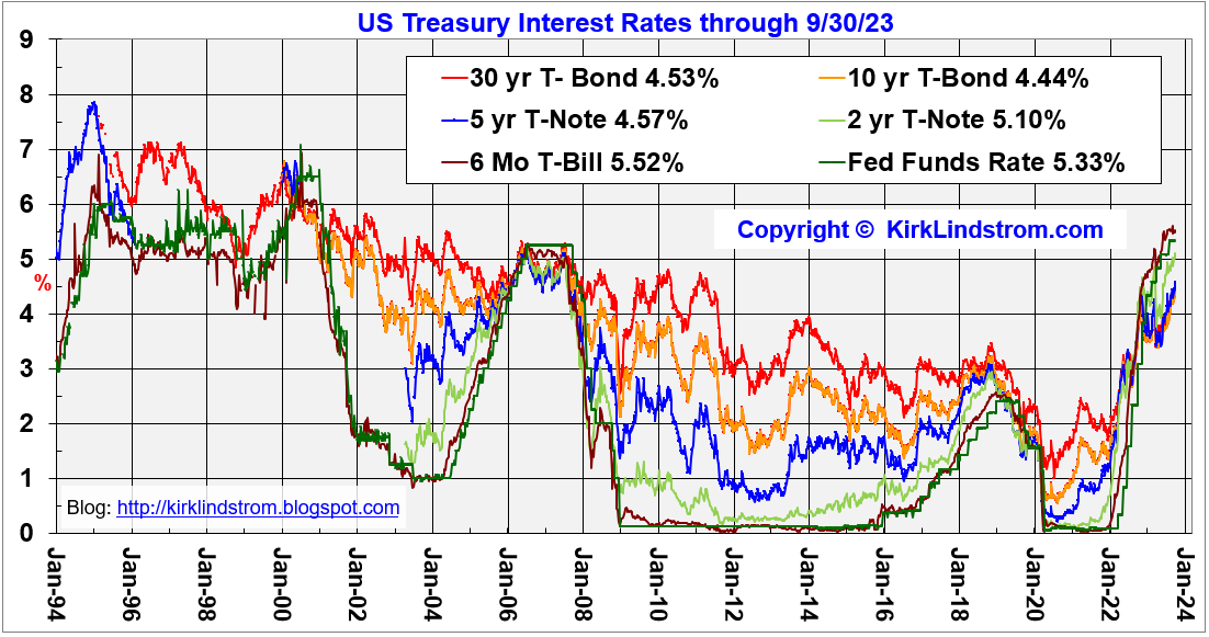
 US Treasury Interest Rate graphs from 1/1/94 through 9/30/23


US Treasury Yield Curve
from https://www.ustreasuryyieldcurve.com/ 


 US Treasury Interest Rates

From https://home.treasury.gov/ 

TIPS:

Kirk Lindstrom's Investment Letter

To see what stocks and ETFs are in my "Explore Portfolio" and get a full list of on my price targets to both take profits or buy more:
 Subscribe NOW and get
the
 October 2023 
Issue for FREE!!
(If you mention this ad)

Friday, September 15, 2023

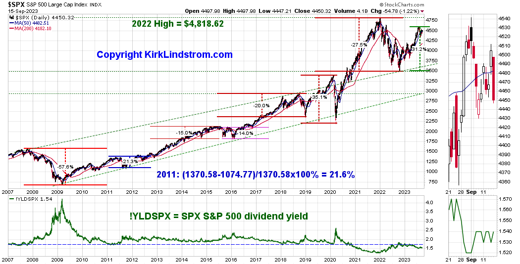
Market Update, Interest Rates, Yield Curve & US Treasury Debt

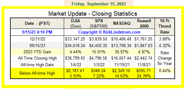
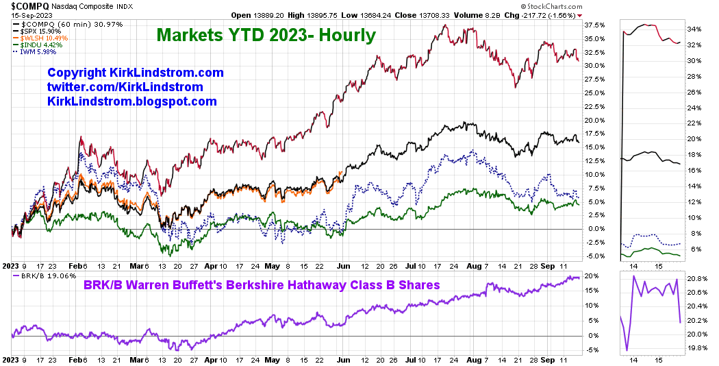
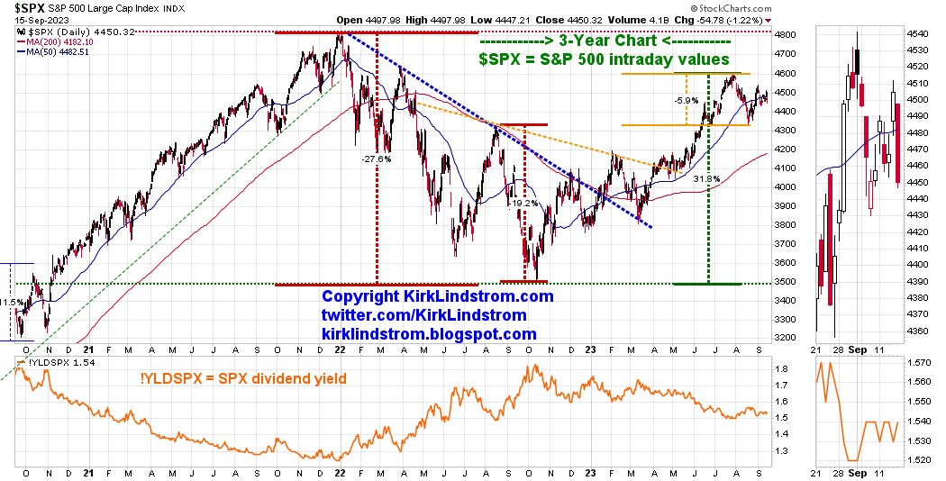
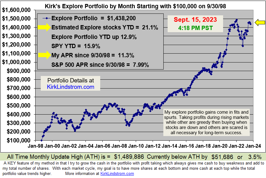
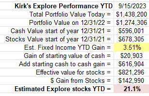
Market Update for September 15, 2023


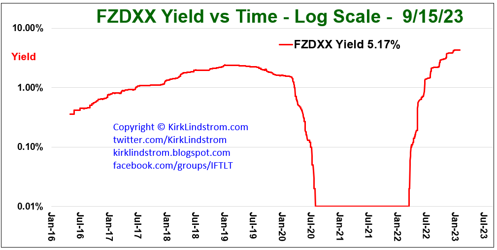
 FZDXX Money Market Fund:


US Treasury Yield Curve 

https://www.ustreasuryyieldcurve.com/
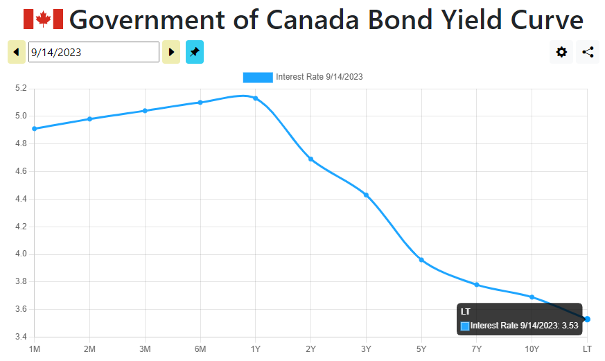
Canada Bond Yield Curve 

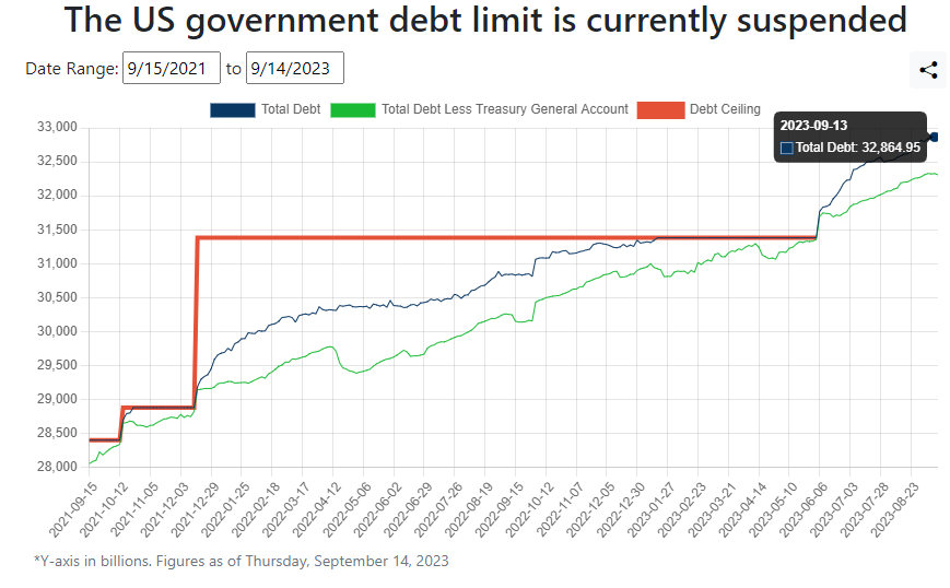
Total Treasury Debt


Ask questions and read discussion on my Facebook Investing for the Long-Term
 group.


To see what stocks and ETFs are in my "Explore Portfolio" and get a full list of on my price targets to both take profits or buy more:
 Subscribe NOW  and get
the
 September 2023 
Issue for FREE!!
(If you mention this ad)

x

Saturday, July 22, 2023

US Treasury Rates, Graphs & Yield Curve

 US Treasury Interest Rate graphs through 7/21/23


US Treasury Yield Curve
from https://www.ustreasuryyieldcurve.com/ 


 US Treasury Interest Rates

From https://home.treasury.gov/ 


TIPS:


Kirk Lindstrom's Investment Letter

To see what stocks and ETFs are in my "Explore Portfolio" and get a full list of on my price targets to both take profits or buy more:
 Subscribe NOW  and get
the
 July 2023 
Issue for FREE!!
(If you mention this ad)


Monday, March 25, 2019

Relationships between Treasury Rates, Yield Curve Inversions, Recessions and the Stock Market

Here are some charts showing clear relationships between US Treasury rates, yield curve Inversions, recessions and the Stock Market.

This is the curve that has so many talking about inversion with the 3-month US treasury paying 0.02% more than the 10-year US Treasury.


Yield Curve 10yr - 3Mo
This is the curve that looks out 30 years compared to 1 year:
Yield Curve 30yr-1yr

Yield Curve:  30yr / 3Mo

Rates 10 & 30 Year USTs


Don't miss out!

And get the March Issue for FREE!

Speaking about yield inversion, Art Cashin, UBS Director of Floor Operations, said on CNBC on 3/25/19:
Every inversion is not followed by a recession but every recession is proceeded by an inversion.  So is it worrisome, Yes?  Is it a guarantee?  No.
S&P 500 Chart:

Tuesday, December 04, 2018

US Treasury Yield Curves for 2018 by Kirk

Many blame the stock markets' huge decline today on worries the yield curve (Figure 1) will fully invert. Inverted yield curves often, but not always, precede recessions. Just today the markets fell between 3.1% and 4.4% as Figure 2 below shows.  

Generally the larger the inversion the higher the odds of a recession in the next year.  
Fig 1
Today's Market Action
Fig 2
You can see from the graph above and table below that short term rates are higher than on 9/28/18 while intermediate to long term rates have fallen which is what has to happen before the yield curve inverts.  
Fig 3
A "healthy" yield curve has rates increasing with term from one month to thirty years which we do not have now.

The yield curve is reflecting fear the "Trump Trade War" will push the country into a recession.  
Fig 4
Link to Tweet

The Stock markets, as this table shows, are down between 6.7% and 15.0% below their recent, all time peak values with the Russell 2000 small cap index down the most!
Fig 5
Don't miss out on the next buy or sell alert! 

Fig 6
Fig 7
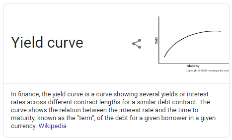
Yield Curve Definition from Wikipedia


Sunday, March 16, 2008

The Yield Curve Spread as a Market Predictor

This graph shows the 30-Year Treasury Bond (T-Bond) interest rate divided by the 3-month Treasury Bill (T-Bill) discount rate with the S&P500 price on the same graph.
Click chart courtesy of StockCharts.com to see it full sized.

Historically, periods with an inverted yield curve (circled areas) have been followed by a recession and falling stock prices.

The chart may speak for itself but to get my take on what this chart indicates for the future, read the April 2008 edition of "Kirk's Investment Newsletter" due out around Easter which is March 23 this year.

Followers - Click "follow" to get an email alert for new articles

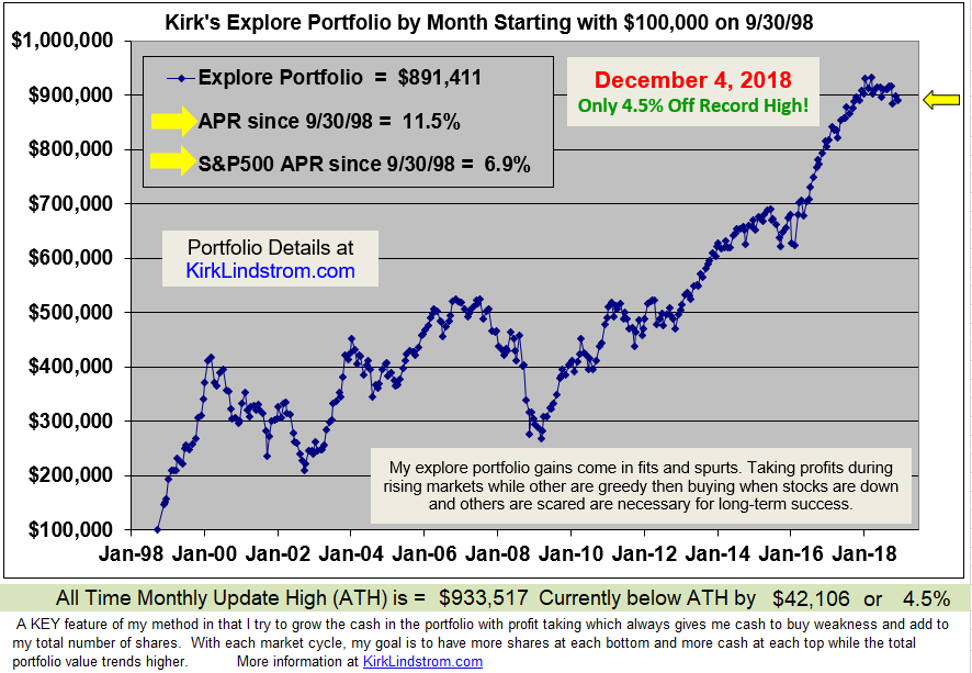
Kirk Lindstrom's Investment Letter Performance