Don't Miss Out On Great Gains! - Best Investment Newsletter


Click for FREE sample of Kirk Lindstrom's Investment Letter

Don't miss out! Subscribe Now

google.com, pub-7001134751860982, DIRECT, f08c47fec0942fa0

Search For More

Showing posts with label $SPX. Show all posts

Wednesday, May 08, 2019

CNN Fear & Greed Index vs. S&P 500

The "Fear & Greed Index" from CNN Business is currently showing "moderate Fear" with a reading of 42 on a scale of zero to one hundred. Here is a snapshot of the index for today.


Fear & Greed Index for May 8, 2019
This chart shows the Fear and Greed index readings over the past 3 years plotted with the S&P 500 over the same period.
This index is a summation of seven indicators explained in detail here
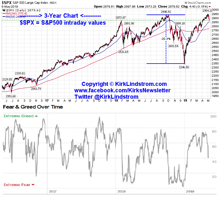
  1. Stock Price Momentum: The S&P 500 versus its 125-day moving average
  2. Stock Price Strength: The number of stocks hitting 52-week highs and lows on the New York Stock Exchange
  3. Stock Price Breadth: The volume of shares trading in stocks on the rise versus those declining.
  4. Put and Call Options: The put/call ratio, which compares the trading volume of bullish call options relative to the trading volume of bearish put options
  5. Junk Bond Demand: The spread between yields on investment grade bonds and junk bonds
  6. Market Volatility: The VIX, which measures volatility
  7. Safe Haven Demand: The difference in returns for stocks versus Treasuries
How I use this information:

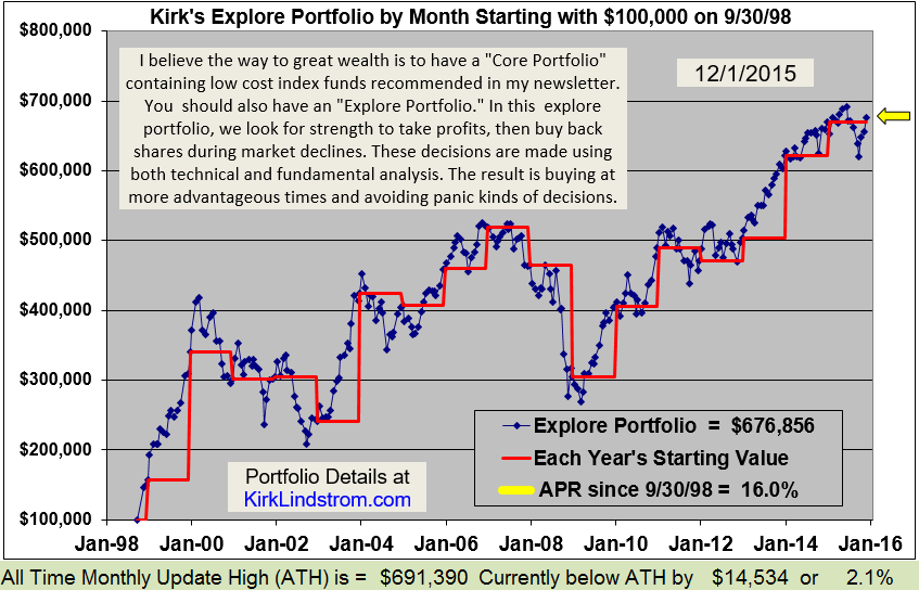
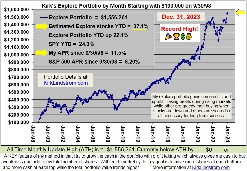
You can see from the two graphs below that my portfolio is well above its 2018 peak while the S&P 500 with dividends reinvested in SPY is back where it started.  This "ratcheting" of returns adds up over time, especially with compounding.

I use periods of strength with highly bullish sentiment (Max greed on the Fear and Greed charts) to take profits then I use the cash to buy again when others are fearful.  You can see from my Explore Portfolio performance graph that this has allowed me to crush the returns of the S&P 500 while having far less risk with typically 60 to 65% in stocks.  If you are young, you could probably do even better with more in my Explore Stocks as I did when I was much younger. 
Don't miss out!

And get the May 2019 Issue for FREE!

To understand more about my method, please read these KEY articles:


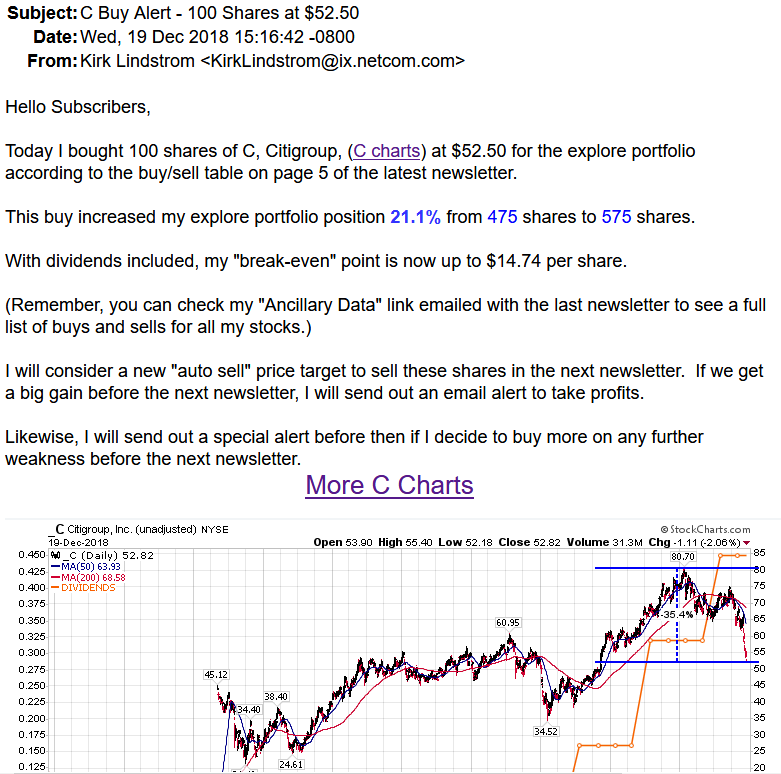
Here are some more examples of email alert headers.

Discuss this article on my "Investing for the long term" Facebook group. 


Monday, March 25, 2019

Relationships between Treasury Rates, Yield Curve Inversions, Recessions and the Stock Market

Here are some charts showing clear relationships between US Treasury rates, yield curve Inversions, recessions and the Stock Market.

This is the curve that has so many talking about inversion with the 3-month US treasury paying 0.02% more than the 10-year US Treasury.


Yield Curve 10yr - 3Mo
This is the curve that looks out 30 years compared to 1 year:
Yield Curve 30yr-1yr

Yield Curve:  30yr / 3Mo

Rates 10 & 30 Year USTs


Don't miss out!

And get the March Issue for FREE!

Speaking about yield inversion, Art Cashin, UBS Director of Floor Operations, said on CNBC on 3/25/19:
Every inversion is not followed by a recession but every recession is proceeded by an inversion.  So is it worrisome, Yes?  Is it a guarantee?  No.
S&P 500 Chart:

Friday, December 30, 2016

US Stock Market Summary for 2016

Market Update -  The US stock markets all made record highs this month and closed the year less than three percent below those record highs.  This table summarizes the data:
Click images to see full size

This graph shows the market data graphically for 2016 through 12/30/16.
Note the table above shows:
  • The S&P500 is 22.40% from its February 11th closing low, the day I wrote this free article "With SPY Down 14% Again, Sentiment Charts Suggest Another Tradable Low"
  • The Russell 2000 (small cap index) is up 42.30% since the February 11th low.
  • I didn't just write about this being a great time to buy, I sent out special alert emails to my newsletter subscribers while the market was bottoming in January and February as this summary of my email headers shows:
  • Feel free to verify with my subscribers who post on my Kirk Lindstrom's Investment Letter Facebook Page.
 This graph shows the S&P500 ETF SPY and its dividend back to 1992.

This graph puts the Dow Jones Industrial Average into perspective using a log chart.  Many pundits on TV say lowering the corporate tax rate will allow hundreds of billions of dollars to return to the US where some will be used for share buybacks.  This buying by companies plus scared bond investors looking for return, could easily drive the Dow back to the center blue line... of course a bear market could also drive it to the lower blue line first so I take profits at new highs to have funds to buy the declines and thus beat the market over time like very few others have.

Kirk Lindstrom's Investment Letter:
Subscribe NOW & get the December 2016 Issue for FREE!!! 

Congratulations to everyone who is in the stock market this year!
Happy New Year!

Wednesday, April 20, 2016

SPY New Record Highs - Closing & Intraday

Today SPY made new record highs for both closing and intraday values. 

SPY is a mutual fund I've recommend in my free articles at Seeking Alpha, in my newsletter's "Explore Portfolio" and the largest fund in both my newsletter's core portfolios. 

Congratulations to everyone who owns this fund and reinvests dividends as everyone is a winner when it closes above its prior intraday high.

Note the old records were 209.74 and 209.16 for intraday and closing highs, respectively.


I cover SPY in more detail my newsletter:
Kirk Lindstrom's Investment Letter
Subscribe NOW 
and
get the
 
April 2016 Issue for FREE!


Friday, December 04, 2015

SPX and SPY Just 2% Below Record Highs - Market Update

With today's big rally in the stock markets, the S&P500 is only 1.8% below its record closing high.
This is quite a recovery from just a few months ago when the markets were down double digits and I was buying shares for my newsletter portfolio. (see 
Here is a buy alert to my subscribers for Lam Research (LRCX) when it tested its August Lows a month later in September.

Fast forward to today.  Note how these charts below show buyers have shown up below the 200-day moving average, MA(200) when the price is just above the 50-day moving average, MA(50).   


Many consider it a very bullish "Golden Cross" when the MA(50) crosses above the slower moving MA(200).  At the rate the market is moving higher, this could happen soon and I'll be taking more profits.  If we fall, I still have some stocks with "Automatic Buy Levels" listed in the December newsletter that I'd be very happy to buy more of on weakness that hits my targets.

Learn my "Core and Explore" approach to investing
with "Kirk Lindstrom's Investment Letter"
Don't miss out! Subscribe Now
I have a very generous Refund Policy 

Tuesday, December 01, 2015

Santa Clause Rally!

Below are several charts showing the "Santa Clause Rally" that seems to be gaining steam. 

After buying the big decline a few months back, some stocks are already very, very close to taking profits already!


Santa Clause Rally! $SPY $SPX $LRCX $MSFT $GOOGL $INTC ChartsI sure hope nobody is missing out on all the fun as we are creeping back towards record highs again. Here comes Santa.....
Posted by Kirk Lindstrom's Investment Letter on Tuesday, December 1, 2015

This is my buy alert for LRCX on the most recent decline below $65.

Followers - Click "follow" to get an email alert for new articles

Kirk Lindstrom's Investment Letter Performance